
Time does fly fast when you are having fun! It’s been a great year for Agent Image. We got acquainted with new clients at the trade shows we attended and had the chance to connect with thousands of agents and brokers. We wanted to hear out what people are looking for in the world of marketing, technology and design, and we learned so much from our conversations along the way. In 2019, the Agent Image team decided to try out new and never-seen-before design elements, to improve our craft at building unique layouts. We definitely got the creative juices flowing, and most importantly, we launched a lot of successful agent websites in 2019!
To cap off the year (and decade) on an extremely high note, we’d like to take a step back and analyze some of the best work we produced, which we are proud to share with the world. Presenting Agent Image’s Best Real Estate Websites of 2019.
-
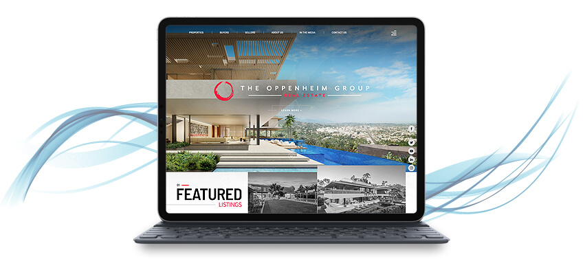
Oppenheim Group
It’s been a while since we designed this website for Los Angeles heavyweight Oppenheim Group, but it continues to shine. Its sleek design, outstanding user experience, great use of imagery and accents, not to mention the strong branding present in all the web pages, stand the test of time.
Oppenheim Group’s real estate website is so good, it even garnered recognition from Real Trends’ 2019 Website Rankings. OGroup.com was named the best of the best.
-
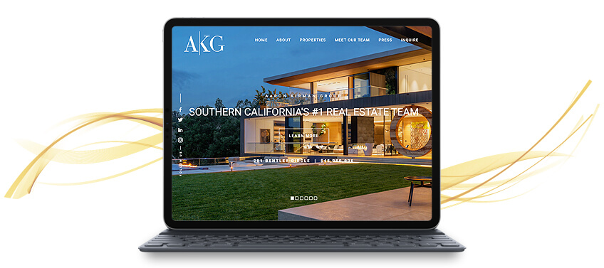
Aaron Kirman Group
When it comes to branding, we like to flaunt Aaron Kirman Group’s real estate website. Our designers merged classic design elements such as full-width, high-definition imagery, and stylish sans-serif fonts with funkier details. Check out that hip pink-and-black background we used in the homepage text and bottom of the page.
AaronKirmanGroup.com is the perfect example of why traditional and bold design elements can work together brilliantly— when done right!
-

Tracy Tutor
Since we launched TracyTutor.com, it immediately became a hit. The classic design, complemented by a minimal color scheme and dynamic effects, was highly lauded, so much so that the website became one of Agent Image’s standard bearers.
Real Trends named TracyTutor.com as one of the best real estate website designs this year. It’s also the paragon of an elegant and timeless real estate website. You can say that it became a popular design reference for our other projects.
-
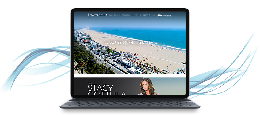
Stacy Gottula
Putting an agent’s area of expertise at the forefront of their real estate website’s design is a tried-and-tested method. Just take a look at StacyGottula.com. We captured the essence of Los Angeles luxury lifestyle in website form.
How did we do that? We used trendy colors (such as living coral, Pantone’s color of the year for 2019), videos, and hover effects that pop to create a memorable real estate website, sure to make a positive and lasting impression on visitors.
-
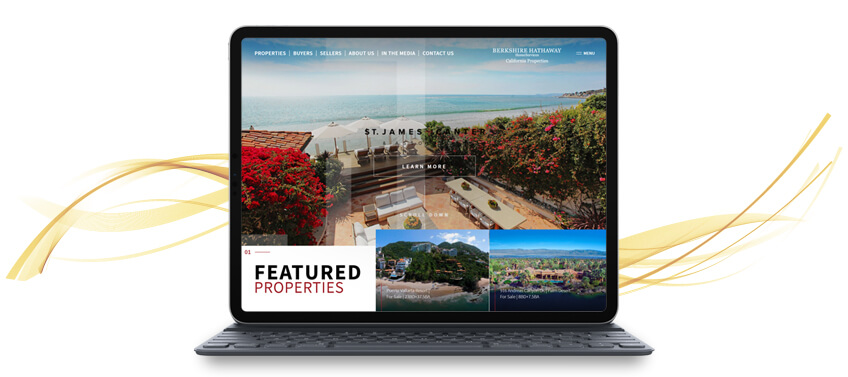
St. James + Canter
St. James + Canter’s real estate website is another standard bearer, a part of a group of successful projects that have become a rich source of inspiration for real estate web design.
Since St. James + Canter prides itself for being great storytellers in real estate, we also made sure their real estate website also told their story through personal branding.
-

James Weekley
Do you know what makes a great agent website? It serves a dual function. Aside from being a platform for buyers and sellers to meet an expert realtor (in this case, James Weekley), it is also a valuable source of information for just about anything, from real estate to lifestyle. And in this sense, JamesWeekley.com excels. It was even named by Real Trends as the Best Agent Website of 2019.
With hyperlocal information and a high level of personalization all throughout the website, that award is definitely well-deserved.
-

The Nöel Team
Here’s another real estate website from Santa Monica that did extremely well in this year’s Real Trends website rankings. Thanks to its well-constructed homepage and great user experience, the site was included in Real Trends’ top 10 best mobile websites. Our designers made sure every page on TheNoelTeam.net looks great on desktop and on mobile.
-

Valley Luxury
Valley Luxury’s real estate website became one of our best projects this year for one very special reason: lead generation. After building, designing, and launching ValleyLuxuryPartners.com out into the world wide web, it proved to be a magnet for leads. Simply put, it’s one of the websites we worked on that generated the most number of queries. This is a testament to the website’s efficiency as an agent and real estate platform.
-
Ernie Carswell
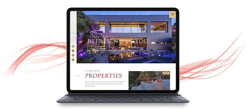
CarswellAndAssociates.com is another one of our projects that has inspired other agents who lead their own companies and teams and want a real estate website that represents them well. At front and center, we started with telling visitors about Ernie Carswell and his achievements. Then, we proceeded to introduce the rest of his team and followed it up with a great call to action.
-
Louise Phillips Forbes
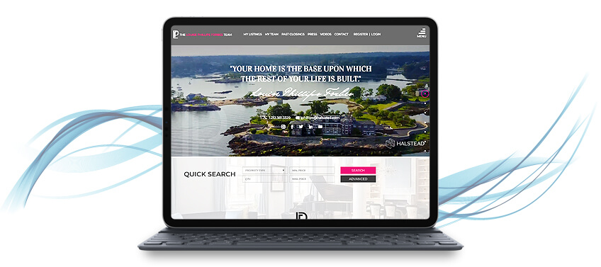
Right from the get go, LouisePhillipsForbes.com feels warm and personal. Our client, Louise Phillips Forbes, was so great to give a nice quote, which we then used as part of our hero shot to welcome potential clients. Other personal touches include the pink accents, the video montage that went superbly well with the quote, and the social media plug-ins that gave the website real-time updates.
-

TD Smith
When you work in a place as breathtaking as Telluride, you’ll want to showcase everything that place has to offer. For TD Smith, we made sure to balance all the design elements so each important segment (his expertise, Telluride, and the local real estate) are given their own stage, all while keeping the homepage short and streamlined.
-
Town and Country Real Estate
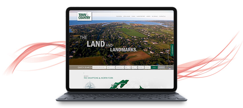
What better way to show potential clients the local real estate and add a sense of place to the website by adding an interactive map? The one we included in Town and Country Real Estate’s website may just be our best one yet. There’s some dimension to the map to breathe life into it.
Instead of the usual layout for featured properties, we also experimented with a gallery wall layout to provide more visual interest. All these show minor tweaks to classic design elements can spice things up.
-

Valery Neuman
There are many modern real estate websites in our portfolio, but ValeryNeuman.com stands out strongly from the crowd. We went for a monochromatic look, using shades of grey throughout the website, and used interesting shapes, such as triangles, for some pizzazz.
Another unique feature is the hover effect for the featured properties. It has Valery’s initials (VN), which further boost her branding. The level of customization for this website is off the charts!
-

Eric Iantorno
While most of the websites in our list shine because of their unique designs, we have a handful who leave a mark some other way. Lead generation is important if you want to boost your business, and Eric Iantorno’s website is good at it. We placed calls to action and buttons in strategic points. This seems to have worked as EricIantorno.com is one of our top performers in lead generation.
-
The Van Zanten Depaoli Group
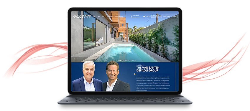
Once in a while, we encounter clients whose real estate skills and expertise encompass different regions and markets. Take the Van Zanten Depaoli Group, for example. Their target markets stretch from coast to coast! To highlight this impressive feat, we made sure to include tidbits of their featured communities in the homepage. We also made their website a design reference for agents and brokerages that deal in multiple markets.
-

Ryan Chiodo
It’s not an easy thing to make your real estate website a one-stop destination and go-to resource, but one look at RyanChiodo.com makes the endeavor look effortless. The website is not only chic and stylish. It has proven itself a valuable resource, with all its pages containing useful real estate information. No wonder Real Trends named RyanChiodo.com one of the best agent websites of 2019.
-

Christie Perkins Orros
TallyRealEstate.com, Christie Perkins Orros’ real estate website, became one of our prime examples for agent-brokerage sites. We love how the overall design turned out. There is enough of Christie’s personal touch throughout the website, and Coldwell Banker is prominently placed on the top part of the homepage.
-

Aaron Kirman
When you’re a realtor as accomplished as Aaron Kirman, you need a real estate website that can do a grand job of representing you.
AaronKirman.com is an example of a no-frills real estate website. The homepage is short, the design minimal, and the color scheme black and white. This fantastic less-is-more approach is versatile, which is why the website has also become a popular example of what we can do with minimalistic real estate web design.
-

Quintessentially Real Estate
Quintessentially Real Estate is another great example of what you can do with what is considered a classic real estate website design. We played around with some of the design elements, incorporated overlays, and used a different approach for the color scheme to create a real estate website that is elegant and yet dynamic. Although it was only launched in the fourth quarter of 2019, Quintessentially Real Estate is also well on its way to becoming a top agent website.
-
CJ Penna
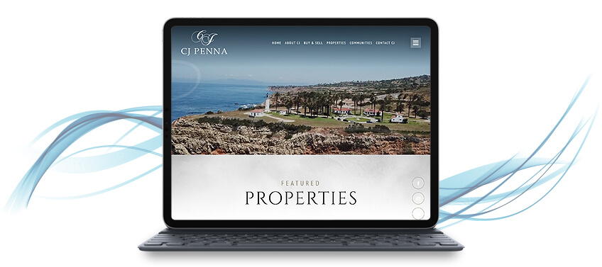
How do you get a real estate website to move? Is it even possible? Video games have been using parallax scrolling for ages, and now, we’ve been incorporating this design element to more real estate websites. CJPenna.com, for instance, is a great example and shows just how much you can play around with unorthodox design features and apply them to professional websites.
-

Quiana Watson
Quiana Watson is a star when it comes to lead generation, and it’s easy to see why. There are plenty of opportunities in the homepage alone to encourage visitors to look around. This leads to an ever increasing number of inquiries. We made the homepage show all the essentials while leaving out enough information to make potential clients truly explore this beautifully designed real estate website.
-

Sarah Marchese
With LifestylePropertiesLA.com, we saw how far we can push the envelope when it comes to using photography in real estate web design. Vivid images of key communities and featured properties are enough to pique the interest of any visitor, inadvertently leading to more leads. Photography is also well utilized in the slideshow that greets visitors the moment they visit the website.
LifestylePropertiesLA.com is also a trendsetter. When it launched, it is one of the few real estate websites to feature personalized hover effects to boost agent branding.
-
Robert Slack
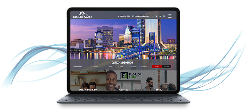
Most of the time, people are hesitant to experiment with color. With RobertSlack.com, however, it’s the complete opposite. The client gave us a green signal to use a bright and punchy red as the dominant color for the website. We toned it down with using a white background, and the overall effect is pleasant and impactful. Let this be a design reference if you want to be more adventurous with color.
-

Alexander Anu
Alexander Anu’s real estate website has a different kind of homepage. It’s laid out like a slideshow, with a main navigation bar on the side to redirect potential clients to real estate sources, featured properties, and property listings. Because of this unique layout, AnuLifestyle.com attracts a lot of leads.
The design is also agent-centric— an online calling card of sorts Alexander Anu can easily use to introduce himself to new clients and leave a positive and memorable impression. This, along with the out-of-the-box design and effective lead generation, makes it an Agent Image favorite.
-

Bogari Agency
Imagery is powerful, especially in a real estate website. We made effective use of full-width and high resolution images for the slideshow of Bogari Agency’s site. This is what first greets visitors to the website. BogariAgency.com also presents a fine case for embedding videos on real estate websites.
-
Champions Realty
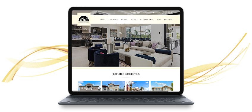
ChampionsRealty.com is one of our best examples of how a simple design can still be effective for real estate websites. Content, however, is this website’s strongest suit. Champions Realty firmly establishes itself as the go-to expert on Orlando, Florida real estate with hard-hitting facts and information on lifestyle and turnkey communities. No one can deny that ChampionsRealty.com is a valuable resource on Disney Corridor homes and rentals.
-
The Noel Team
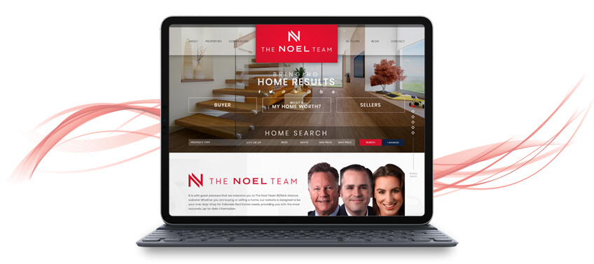
TheNoelTeam.com of Avenue Longmont Colorado snagged the second best design for real estate websites in Real Trends’ 2019 ranking. It’s clear why. The site offers clear navigation and layout and their own unique value proposition, all of which help create a memorable user experience. The Noel Team has been with us since 2014 and we watched their real estate website design evolve, balancing classic design tenets while keeping up with the times.
-

Dillard and Company
A loyal Agent Image client since 2006, we know real estate is not just a business but a passion for Dillard and Company.
Unlike most real estate websites where the imagery is focused on the featured properties and the locale, Dillard and Company’s site also infuses some warmth by adding high-quality photographs of people living in Atlanta’s fine homes. The effect feels as if you’re taking an intimate look into private lives, and visitors are left wanting to live like what was depicted, too.
-
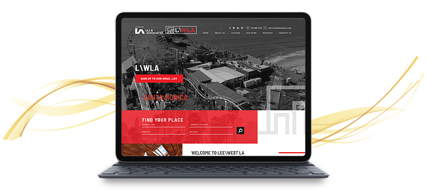
Lee & Associates
We consider LeeWestLA.com as one of our finest examples of websites for real estate brokerages. A division of Lee & Associates, this site pays tribute to their parent firm all while leaving their own mark and exuding some of Los Angeles Westside’s edgy energy.
-

Sam Real Group
Rounding up our list of 2019’s best websites is Sam Real Group. Our designers did an amazing job with this site. Full-width videos and stunning imagery, parallax scrolling, and the modern color palette of black and gold make this website ooze with personal style. No wonder it was also named by Real Trends as one of their top 10 best design sites.
This 2020, we’re looking forward to even more innovation and creativity in real estate web design. We’re already on the lookout for the standout design trends that will surely create a lasting impact on the real estate web design industry.
Get ready for the new decade! If you were inspired by any of these top websites and would like to have your own, get in touch with us today for a free consultation.
The post The Year in Review: Agent Image’s Best Websites of 2019 appeared first on Best Real Estate Websites for Agents and Brokers.