Every element on your homepage contributes to your visitors’ initial impression of you and your company. For first time visitors, your real estate website says more than you think. Your goal is to encourage visitors to look at your listings, browse longer and hopefully convert them into clients.
Here, Agent Image reviews some of our premium designed home pages and highlights a few points on why we think they are examples of websites that will help you take your real estate business to the next level.
Brand + Design + User Experience
Unless your viewer has the time of day, your homepage should be compelling enough for your visitors to come in and not go back to Google to look for other sites. That said, you can make a lasting impression by making your homepage as convincing and engaging as possible. Visual design is important; however in reality, user experience is the determining factor on the success or failure of a website’s design.
Properties by the Bay is a great example of a balance between aesthetics and website usability. Navigation is simple and consistent and content is accessible and organized. Branding elements are also of importance. Visitors need to see who you are —your profile, logo, tagline and a link to your success stories should all be accessible from the homepage. Here, the agent’s personality is clearly expressed in her website and her expertise is showcased in her agent profile, resources and property pages.
Expertise
Market yourself in new ways by getting the most out of your real estate website. People value quality website content and a real estate expert should always aim to educate their clients and fellow professionals through their resources and tools pages. Make sure that you have a real estate website that means business by offering visitors valuable content.
A good example is South Bay Digs who prominently features their resources links on their homepage where visitors can view the latest market data, local realtor database, local open house directory and a preview of their latest interactive magazine issue.
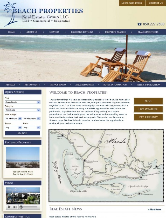
Florida Beach Properties Real Estate Group
The Beach Properties website example above provides several resources links and featured information to show visitors what the Florida coast has to offer. You can also add your property search right on the homepage using a Quick Search form.
Navigation
Giving visitors the experience of user-friendly navigation that is both logical and consistent is of utmost importance. Breadcrumb links, link previews and nav dropdowns let your site visitors know where they’re at, where they’ve been and where they can go next.
Allow your viewers to explore your content further and provide call to action forms and buttons for newsletter sign-ups, blogs, social media links and inquiry forms. The homepage of Shoreline Properties is a great example.
Mary LeBlanc Realty/Shoreline Properties
Page loading time is also important. Keep in mind that not everybody has a fast internet connection. Your homepage should not take ages to load or else your visitors may become impatient and return to the search listings to look at other websites instead of yours.
Convincing Property Photos
Nothing entices clients more than a beautiful listing photo that does justice to the property you’re offering. A good photo gallery followed by detailed property descriptions will be your best bet in showcasing your listings. The property listings on The Hamilton Co. website are great examples. You can also supplement these photo galleries with property videos and neighborhood video tours for more effective marketing.
So the next time you’re looking at other websites, consider the factors mentioned and apply them to your own website too!
For more samples, you may visit our showcase portfolio of top producing websites or contact 1.800.979.5799 for more information.


