
Having a website that makes a strong and lasting impression is vital to your real estate brand. In an increasingly digital business landscape, your next big deal is no more than a click or a tap away.
When it comes to designing and creating professional websites that make an impact, Agent Image is in a class of its own. See for yourself in this showcase of our most recent website designs.
Here are the 10 best websites we launched in October 2020:
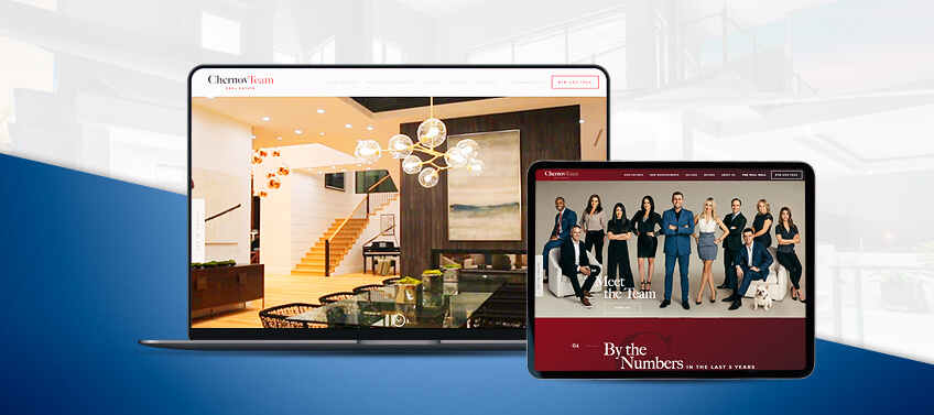
Chernov Team Real Estate San Fernando Valley, California
San Fernando Valley’s premier luxury real estate firm always puts its best foot forward, so it’s no surprise that ChernovTeam.com is designed to impress from top to bottom. From the video wall showcasing the sophisticated lifestyle of Southern California to the “By the numbers” summary of the Chernov Team’s accomplishments, this website wows its visitors in many ways.
Most importantly, ChernovTeam.com gives viewers convenient ways to connect with the company. A “Get in Touch” button hovers permanently along the left edge of the screen, so you can quickly send an inquiry no matter how far down you scroll. There’s a dedicated signup section for the firm’s private listings, market insights, and VIP events, as well.
What makes this website special: While luxury real estate may be an exclusive market, the Chernov Team extends various communication channels to make them feel more accessible.
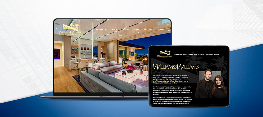
Williams & Williams Estates Group Los Angeles, California
This LA luxury real estate firm wants you to know that you can trust them with your next multi-million-dollar transaction. That’s why they roll out the facts and figures right off the bat on their sharp, polished website.
From the company’s sales total to date to the prices of their record-breaking property sales across various upscale neighborhoods, Williams & Williams Estates Group cites a wide range of data to emphasize the scale of their business and how good they are at doing it.
What makes this website special: TheWilliamsEstates.com leads with the important facts and figures that will put any luxury real estate client’s mind at ease about the company’s expertise.
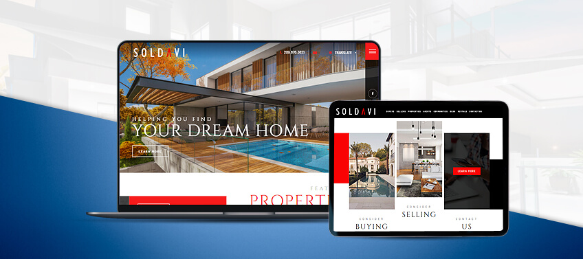
Soldavi Realty Merced County, California
Designed as a one-stop hub of information and resources for people searching for their dream homes in Merced County, Soldavi.com boasts a contemporary design complemented by a smooth, intuitive user experience.
Visually, this website is a delight, with sharp contrasts set by its main black, white, and red color scheme. Hover over a black-and-white property photo and the image pops into vivid color, with a block of text detailing essential information about the featured home. Dynamic design touches like these make Soldavi.com exude confidence.
What makes this website special: Soldavi Realty caters to a global audience of current and prospective clients. That’s why their website includes a “Translate” drop-down button that allows viewers to toggle between a total of nine languages.
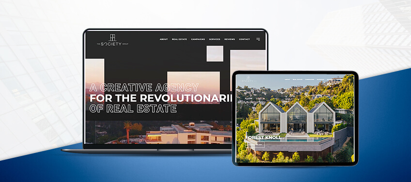
The Society Group Los Angeles, California
The Society Group is not just any real estate firm. They’re a public relations company that represents “the revolutionaries of real estate.” This company prides itself on high-concept and high-quality storytelling befitting the Hollywood market that it serves. This is why when you see a lightsaber battle on their homepage, you know they mean business.
Decked in dynamic, magazine-style design layouts, TheSocietyGroupPR.com features case studies of the company’s standout campaigns. This gives viewers plenty of real-life references for this firm’s impressive body of work. With an excellent blend of both style and substance, the website is as engaging as it is attention-grabbing.
What makes this website special: With large, bold typefaces against subdued and minimalist backgrounds, this website “reads” like a bold yet refined fashion magazine. A unique look for a unique company.
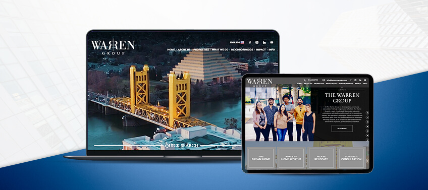
Tribe Realty Tampa and Orlando, Florida
Good design is about more than just strong and memorable visual elements. The message that you want to convey matters just as much as the beautiful photos and tidy layouts you put on display.
TribeRealtyFL.com combines eye-catching design with choice content. First, “power words” like “enrich,” “purpose,” and “innovation” excite visitors right at the top of the homepage. Then, a visual summary of the firm’s listing tools and services follows a few scrolls down, including a step-by-step breakdown of the company’s listing process. Anyone who browses this website will easily find the information they need right away, leading to quicker and more effective lead generation.
What makes this website special: Strategic content elevates beautiful visual design. Tribe Realty uses both to great effect for a complete package that website viewers will find useful and engaging at the same time.
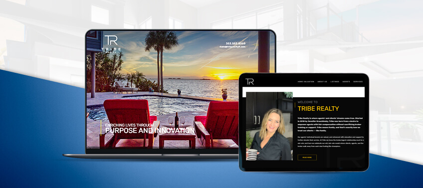
Solomon Smith Los Angeles, California
LA luxury Realtor Solomon Smith channels his cool, professional confidence by utilizing a sophisticated black and white color scheme throughout his real estate agent website. It’s the perfect look for a brand that deals with a discerning, high net worth target market.
The design is as functional as it is appealing, as well. On SolomonSmith.com, information is readily available straight from the homepage. From the brief profile of the agent right below the fold, to the well-organized links to real estate resources like featured listings and property search or valuation tools, this website offers ease of use, regardless what type of device is used to view it.
What makes this website special: SolomonSmith.com is proof that beautiful design never has to be complicated. With a professional theme and a straightforward layout, it seamlessly combines form and function.
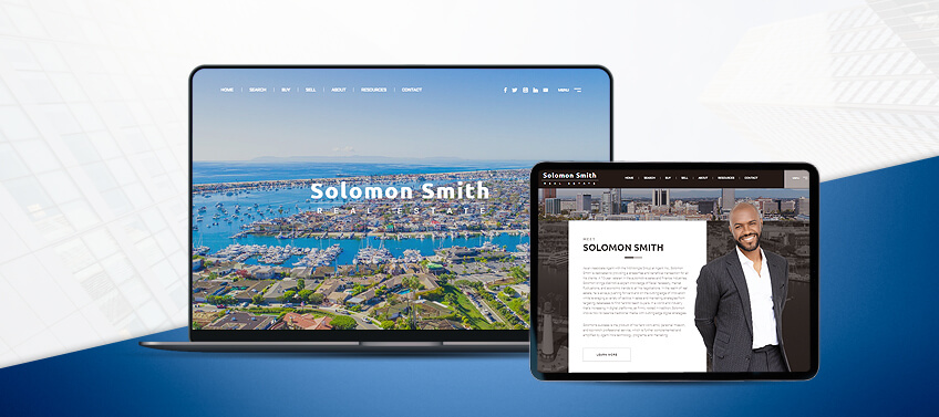
Brian Bord Los Angeles, California
The first time you load LAHomes4U.com, you’ll see animated line art that resembles a sketch of a sprawling cityscape. But then the image dissolves, revealing a photo of a fully equipped professional recording studio instead. After that, “Homes and Recording Studios” is emblazoned across vibrant, screen-wide photos of lavish LA properties.
With this deliberate presentation, Brian Bord makes it clear that his business deals with a specific market. While he serves the high-value Los Angeles real estate market in general, he specializes in homes best suited for professionals in the recording industry.
What makes this website special: When specializing in a niche market, it’s important to be clear about what you’re offering. Brian Bord does this well with an eye-catching website intro and large, prominent labels on his homepage.
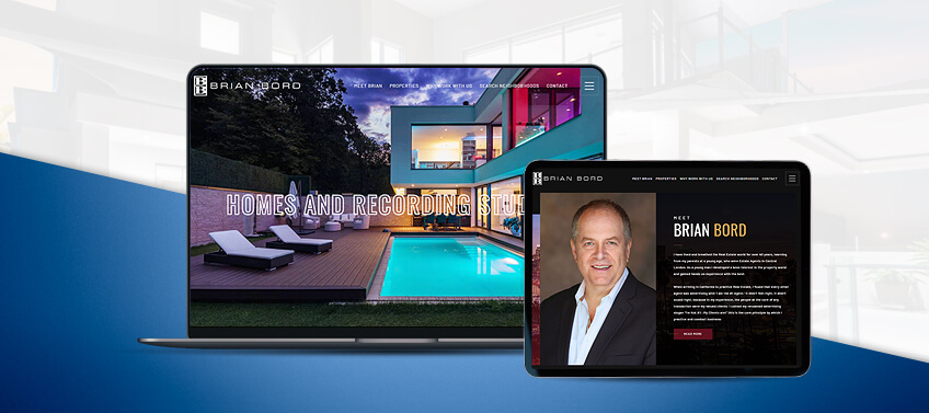
The Warren Group Sacramento, California
With a dazzling video wall and a quick search bar right below it, The Warren Group follows through on their invitation for their website visitors to discover Sacramento. This simple yet effective design encourages viewers to act on their house-hunting needs straight from the main page. It’s built to keep you moving forward.
Below the fold are more dedicated sections that enable more targeted navigation into the website. Visitors are given plenty of options to launch into their home search—whether by featured listings, communities, or even specific development projects.
What makes this website special: By using a photo of the team in street clothes instead of formal wear, The Warren Group presents itself as an accommodating and approachable group of local experts.
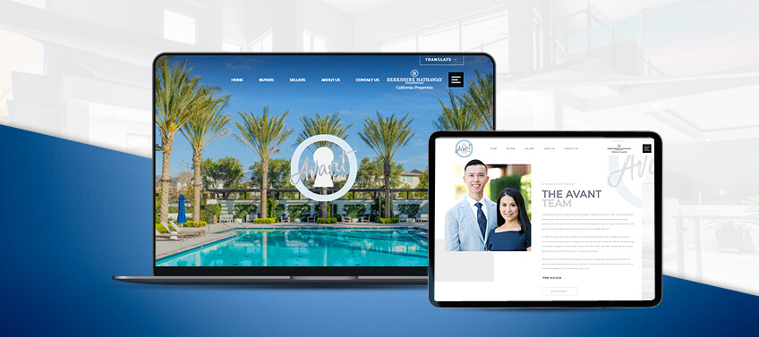
The Avant Team Irvine, California
Using a bright, white-themed color scheme with sky blue highlights, TheAvantTeam.com does justice to the vibrant and pleasant Irvine, California lifestyle. This website sends visitors’ off on their homebuying journeys using large photo tiles to present the firm’s impressive array of featured listings. For homebuyers who want to shop by neighborhood, an interactive map is also available on the homepage.
The Avant Team is a group of multilingual real estate experts, so having a language toggle is a great feature that demonstrates the company’s desire and ability to reach a global audience. The website features 10 different languages.
What makes this website special: TheAvantTeam.com makes good use of a straightforward, functional design. Simple and easy to use, thesite is a clear expression of the firm’s commitment to putting their clients’ needs first.
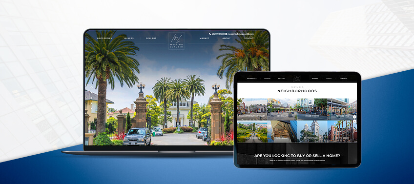
Massimo Loporto San Francisco, California
Real estate buyers in San Francisco Bay Area communities will have a delightful time exploring their options on MassimoLoporto.com. With a clean homepage dominated by large photos in vivid color, this website banks on visual appeal to keep the viewer engaged and curious to discover more.
Despite the minimalist approach, the site keeps essential links accessible. In addition to dedicated sections for active listings and featured communities on the homepage, links to the agent’s Instagram, Zillow, and Linkedin profiles float permanently along the right edge of the screen, allowing for quick and convenient contact via today’s most popular platforms.
What makes this website special: The image-centric, minimalist main screen creates an immersive visual experience that sets the right mood for a thorough and enjoyable home search.
The best things about October 2020’s best websites
As our top websites from last month show, there’s no cookie-cutter design or formula to making the “perfect” website for your business. It all depends on your vision and goals, as well as what you want your brand to say to your target audience.
Let’s break down how each of Agent Image’s best websites for October stand out individually:
-
ChernovTeam.com – The Chernov Team makes San Fernando Valley luxury real estate feel more accessible with convenient methods for staying in touch and up to date.
-
TheWilliamsEstates.com – This website lets the numbers do the talking for the Williams & Williams Estates Group, establishing their authority in an instant.
-
Soldavi.com – An outstanding example of what a contemporary real estate website looks like, Soldavi.com combines dynamic visual design with rich content, all made accessible to a global target audience.
-
TheSocietyGroupPR.com – Browsing through this website feels like leafing through a sophisticated fashion magazine, thanks to the combination of elegant layouts and meaty featured content.
-
TribeRealtyFL.com – A flowing, modern layout filled in with relevant content right on the homepage — this is how you make a good first impression on your target market.
-
SolomonSmith.com – Simple is elegant. With a straightforward design, this website exudes an indisputable air of professionalism and confidence that reflects the agent’s top qualities.
-
LAHomes4U.com – With prominent labels on LAHomes4U.com, Brian Bord clearly defines the niche market that he serves, as well as the listings that he offers.
-
TheWarrenGroupRE.com – From the intuitive, action-oriented website design, to the clear expression of the team’s laidback, community-centered personality, this website makes visitors feel right at home in Sacramento.
-
TheAvantTeam.com – Bright and uncluttered, this website offers a pleasant user experience that matches The Avant Team’s client-first approach.
-
MassimoLoporto.com – This website’s effective use of the minimalist aesthetic allows for an immersive experience that keeps the viewer wondering about what great opportunities this Realtor can offer.
Get a professional website tailored for the success of your real estate business
Take your real estate business to greater heights with a website that not only catches attention, but also fully captures your vision and personality. Our design and marketing experts here at Agent Image can make that happen. Call us today at 800.979.5799 to get a free consultation on your ideal online marketing strategy.
The post 10 Best Real Estate Websites for October 2020 appeared first on Best Real Estate Websites for Agents and Brokers.