Agent Image’s website design process starts with your unique story. We strive to capture what your brand is all about and give your clients a great first impression about you and your business. Beyond aesthetics, we also design your website to be functional, reliable, and truly responsive to your marketing goals.
Here’s a look at the outstanding websites we launched in April, 2020:
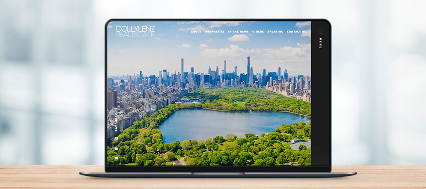
Dolly Lenz New York, New York
The welcome video in DollyLenz.com sends a powerful message, conveying Dolly’s authority and achievements in luxury real estate, whether in NYC, the Hamptons, or across the globe. Scrolling below the fold, you’ll find even more testaments to her expertise, with features on her sales achievements, media appearances, multimillion dollar listings, and notable sales – all captured in a minimalist layout that never overwhelms despite the abundance of information.
This website is best for: Making a great impact and compelling first impression.
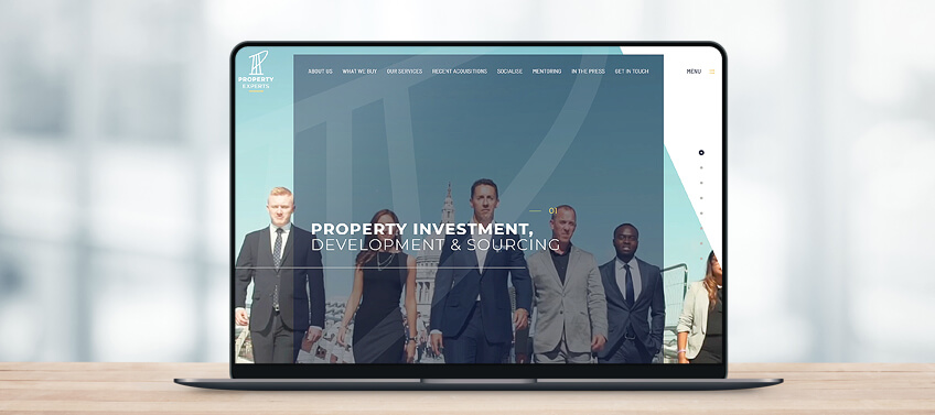
Property Experts London, United Kingdom
“We mean business and we’re here to get you what you want” – this is the undeniable message you get upon entering PropertyExperts.co.uk. As a top real estate investment team in London, UK, Property Experts’ website lets you know you can trust the team in managing and growing your assets. The high quality opening video, gray and white palette, sharp angles, and use of shadows work together to convey this message.
This website is best for: The use of videos, layout, and colors to send out a strong message.
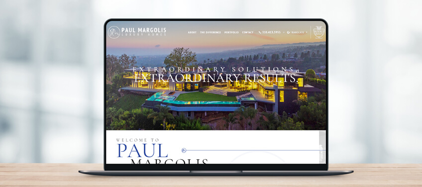
Paul Margolis Beverly Hills, California
Classic, stylish, and dynamic, Paul Margolis’s website captures his approachability and charm, which have helped make him one of Beverly Hills’ most accomplished real estate agents. High definition photos of gorgeous properties establish Paul’s expertise, and the clean lines and linear layout make for intuitive navigation. Parallax scrolling and hover animation provide a dynamic user experience, while the copy gives the website an undeniably personal touch.
This website is best for: Using a clean, uncluttered layout to shine the spotlight on Paul Margolis’s accomplishments and winning personality.
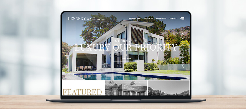
Kennedy & Co. Washington, DC
When you’re a top boutique real estate firm in Washington, DC, you need a platform to convey that to your audience – and show them why. Kennedy & Co.’s website achieves that with flying colors. The simple, straightforward layout is the perfect backdrop for dynamic elements like parallax scrolling and hover animation, engaging users while providing seamless navigation. With the right balance of a clean typeface, B&W and color photos, and succinct copies, KennedyNCo.com informs and invites users without overwhelming.
This website is best for: Balancing a classic layout with dynamic elements to engage viewers and encourage them to stay longer.
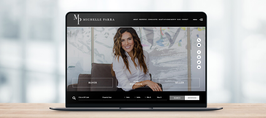
Michelle Parra Los Angeles, California
Michelle Parra’s sleek and sophisticated website aptly captures the upscale Los Angeles market she represents. High definition photos of beautiful homes and LA’s vibrant communities are given center stage, taking visitors on a virtual exploration of the lifestyle in the area. Prominently placed lead capture features and an IDX search bar make for an interactive and engaging user experience. A video of Michelle at work with easy listening music in the background provides a personal touch.
This website is best for: Combining classic elements and contemporary effects for a seamless and engaging user experience.
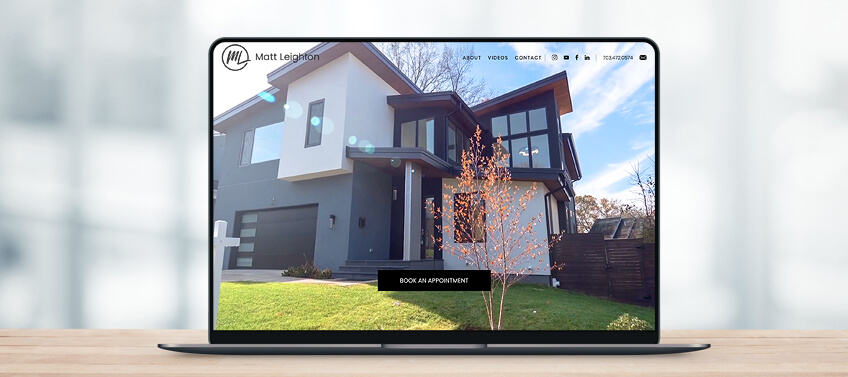
Matt Leighton Arlington, Virgina
Upon entering Matt Leighton’s website, you’ll know right away that he’s the person to call for a fun and stress-free real estate experience. The high quality opening video highlights Matt’s quirky personality while keeping the spotlight on the metropolitan flavor of Arlington, VA. Matt’s “Core Values” are prominently featured in the middle of the page, giving visitors even more reasons to choose him for their real estate needs. Lead capture features are strategically placed, encouraging visitors to get in touch throughout their browsing experience.
This website is best for: Creating a unique and highly personalized touch that promotes trustworthiness and positive vibes.
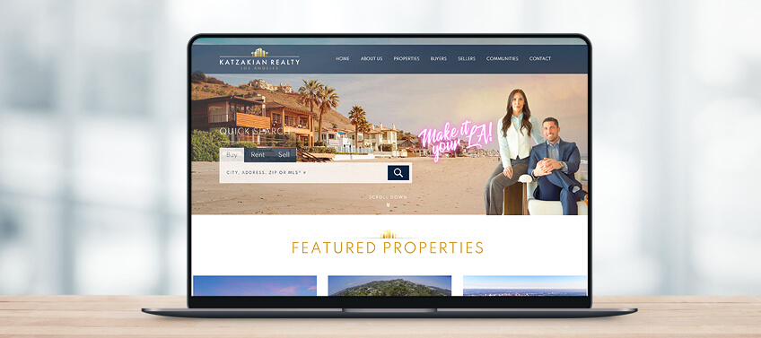
Katzakian Realty Los Angeles, California
In a competitive market like Los Angeles, your website must undeniably show what makes you different from the rest. That’s what KatzakianRealty.com achieves. A Quick Search feature for buyers, sellers, and renters is featured prominently above the fold, urging visitors to immediately take action. The main slideshow features photos with a dusky sepia finish, giving the website a unique character. The team’s tagline, “Make it your LA”, is prominently featured, and the logo’s gold theme color is repeated throughout the page to reinforce branding.
The website is best for: Using colors and catchy features to reinforce branding and set it apart from the rest.
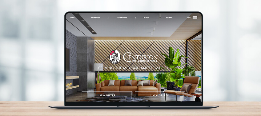
Centurion Real Estate Services Mid-Willamette Valley, Oregon
Centurion Real Estate Services’ arresting logo takes prominence on the homepage, instantly establishing branding. A backdrop of photos featuring Mid-Willamette Valley vistas and dream homes further reinforces what the team is all about. Scrolling below the fold, the various information packed in the website is arranged in panels, allowing easy and seamless navigation. Hover animation creates a fun and interactive user experience.
This website is best for: Creative use of panels and effects to engage visitors and encourage them to explore the site more.
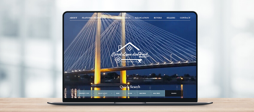
Carol-Lynn DenHoed Tri-Cities, Washington
Carol-Lynn DenHoed’s website offers a real experience, with an opening video that immerses viewers in the vibrant and outdoorsy lifestyle of the Tri-Cities in Washington state. More gorgeous photos below the fold transports visitors to the highly desirable communities represented by Carol-Lynn, and the uncluttered, linear layout ensures these visual treats do not overwhelm. Carol-Lynn’s logo is front and center of the homepage, and her bio follows just below the fold to create an instant connection with site visitors.
This website is best for: Rich visuals made even more effective by a clean layout, multiple vertical panels, and contrasting white space.
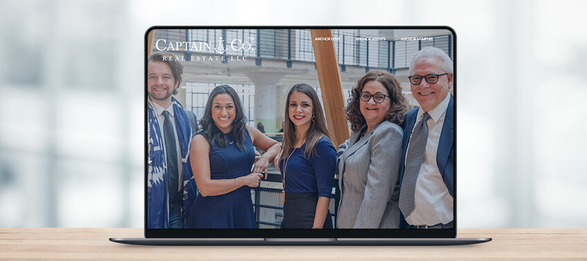
Captain & Co. Real Estate Memphis, Tennessee
Strong branding is what drives Captain & Co. Real Estate’s website. Headed by broker and owner, Fara Captain, captainandco.realestate takes you on a voyage throughout Memphis, Tennessee and its neighboring communities. The team’s wit and humor are undeniably showcased, with page titles such as Anchor Love, Anchor Agents, and Anchor Memphis. The photo that greets site visitors on the main slider is that of a cruising ferry boat, followed by the team’s nautical-themed logo. An interactive map makes the home search experience fun and easy, while lead capture features are strategically placed throughout the page.
This website is best for: Strong branding and name recall features, showcasing the team’s humor and charm.
Let’s recap!
The websites we launched in April 2020 all managed to communicate the unique story of the real estate agent they represent through the thoughtful use of classic and contemporary design elements and tools. Here’s what each site managed to do best:
-
DollyLenz.com – Using powerful videos, photos, and content to make a compelling first impression
-
PropertyExperts.co.uk – The perfect combination of layout, effects, and videos to convey a strong message
-
PMLuxuryHomes.com – Combining a classic layout with personal touches to highlight the Realtor’s achievements
-
KennedyNCo.com – Balancing classic and contemporary elements to convey professionalism and energy
-
MichelleParra.com – Combining a clean layout with dynamic design elements reflecting the luxury LA lifestyle
-
MattLeighton.com – Using high quality videos and personal touches to highlight the Realtor’s engaging personality
-
KatzakianRealty.com – Effectively using colors, photos, and text to convey what sets the team apart from other realtors
-
Centurion-res.com – Using panels, high quality photos, and prominent logo placement for easy navigation and establishing brand identity
-
Tri-CitiesRealEstate.com – Combining rich visuals and a thoughtful layout to highlight the Tri-Cities, Oregon lifestyle
-
Captainandco.realestate – The perfect use of name recall tools and design elements to establish brand identity
At Agent Image, we work closely with our clients to understand their individual goals and create a website that best communicates their personalities, skills, and areas of expertise.
Find out how we can help you spread the word about your brand. Contact Agent Image for a free consultation or give us a call at 800.979.5799.
The post 10 Best Real Estate Websites for April 2020 appeared first on Best Real Estate Websites for Agents and Brokers.