Real estate websites are a dime a dozen, but the truly exceptional ones are harder to find. At Agent Image, we’ve made strides in creating websites that embody our clients’ brand, message, and purpose.
To us, it’s not enough for a website to simply look nice. For a real estate website to truly be effective, it must be functional, easy to use, and it needs to highlight our clients’ services.
With the start of the decade, we’ve decided to lend the spotlight to websites that have stood out the most because of their incredible design, high-tech web features, and great interface giving visitors a remarkable user experience.
Check out these outstanding Agent Image’s website for January 2020:
Bobby Boyd Los Angeles, CA
Celebrity realtor Bobby Boyd’s website encapsulates the luxury and sophistication of the million-dollar listings he represents in Los Angeles.
Bold, block letters invite visitors to “Live beyond the moment” and discover their place in the city. Sleek graphics coupled with parallax scrolling divide each section of the site neatly making it a breeze to navigate.
Why this website is a standout: The branding is on point with images of Boyd prominently displayed on every fold, and the bold typeface is balanced by the black, white, and muted blue color scheme.

The Gold Realtors Los Angeles, CA
The Gold Realtors proudly displays what they’re best known for right on the homepage slideshow. Right below the fold is the featured properties section where black-and-white listing photos come to vivid life as you hover over them.
The streamlined layout expertly frames the site’s other extensive features such as an interactive map of their main communities and a testimonial section.
Why this website is a standout: branding is consistent throughout, from the understated metallic logo to the soft black and gold color palette and minimalist design. It exudes effortless elegance without being too simple or bare.

Lisa Yakulis Philadelphia, PN
Stylish and refined are the best ways to describe Lisa Yakulis’ website. The brilliant use of white with French navy blue and black accents elevates the overall aesthetic of the site.
Easily find the home of your dreams with LisaYakulis.com’s quick search bar or view the gorgeous featured listings further below. This website has the perfect mix of efficiency and great design.
Why this website is a standout: High-quality photographs of Central City, Philadelphia and an array of luxury properties serve as the backdrop for the navigation bar so visitors can easily go to wherever they need to with one click.

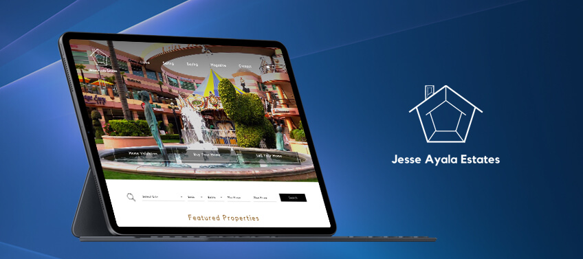
Jesse Ayala Estates Chatsworth, CA
Multiple rolling footage of Jesse Ayala Estates’ key communities takes this website to another level. The videos not only showcase the company’s featured Southern California neighborhoods, they also inject the site with fresh, youthful energy.
Near the bottom of the site, you’ll find their list of services complete with a short description and what you can expect from their team—this is helpful especially for novice buyers and sellers.
Why this website is a standout: JesseAyalaEstates.com features homepage video done right – it’s crisp, consistently paced, and the transitions are seamless. We also love how the animation effects throughout the rest of the site echo the video’s brisk rhythm.

The Chad Carroll Group Miami, FL
A website befitting a Million Dollar Listing star, TheChadCarrollGroup.com shows you the best of Miami’s luxury real estate. With listings pulled directly off the MLS in real-time, its advanced IDX real estate website listing display is unlike any other.
The site also shines the spotlight on the group’s most valuable assets: celebrity realtor Chad Carroll and all the real estate professionals that make up the team.
Why this website is a standout: The website’s vibrant mix of white and teal perfectly encapsulates the beach lifestyle that the team is selling. Also worth noting is how the group’s logo is kept front and center, but the effect isn’t too obtrusive thanks to layering.

Mayne Choice Realty Beaumont, CA
Mayne Choice Realty prides itself on providing honest, timely, and personalized services — values that are reflected flawlessly on their website. Sold listings are displayed proudly on their page to let visitors know why they’re Beaumont, California’s leading residential real estate brokerage.
The site is packed with useful features such as a universal search bar, a reel of client testimonials, buyer and seller guides, home valuation, a list of featured properties, and an easy-to-use community search.
Why this website is a standout: Restrained design touches such as a subtle parallax effect and helpful navigational arrows elevate the look and feel of Mayne Choice Realty’s deceptively simple website. It works flawlessly as well.

The G Green Agency Rancho Mirage, CA
The G Green Agency’s website uncomplicated, contemporary design is complemented by the smart use of subtle scrolling animation. It transforms what could have been a basic site into a dynamic real estate resource.
The site’s red and white color scheme, sans serif typeface, and grid layout are also hallmarks of mid-century modern design – something that the Palm Springs area is particularly famous for.
Why this website is a standout: The mouse-over transition effects and creative tile layout are notable design elements. These website features may be simple, but together they significantly impact the site’s overall aesthetic and UX design.

Jason Wright Estate Newport Beach, CA
With its no-nonsense black and white palette and dynamic bird’s eye view homepage video, Jason Wright’s website inspires confidence and projects professionalism, which is perfectly on-brand for this top-producing South Orange County realtor.
You know you’re in the right place as soon as you click on his website. The site prioritizes ease of use and function with a loaded header that connects buyers and sellers to where they need to go.
Why this website is a standout: With videos, featured listings, quick property search toolbar, and more helpful plug-ins, JasonWrightRealEstate.com accomplishes the goal of being a one-stop shop for all your real estate needs.

The Improta Team Los Angeles, CA
The Improta Team serves the communities of Calabasas, Hidden Valley, Pacific Palisades, Malibu, and Westlake Village in Los Angeles County, and their website reflects the easy elegance these affluent areas are known for.
Using a contrasting black and white color scheme that will never go out of style, Improta.com is polished and tasteful and boasts helpful navigational elements such as a scroll down anchor and a social icons menu.
Why this website is a standout: Improta.com has lead-capturing down to an art – from the newsletter subscription pop-up to the message box to the contact form at the bottom of the homepage. We also love the Improtas’ embedded Instagram feed, which helps you get to know them better.

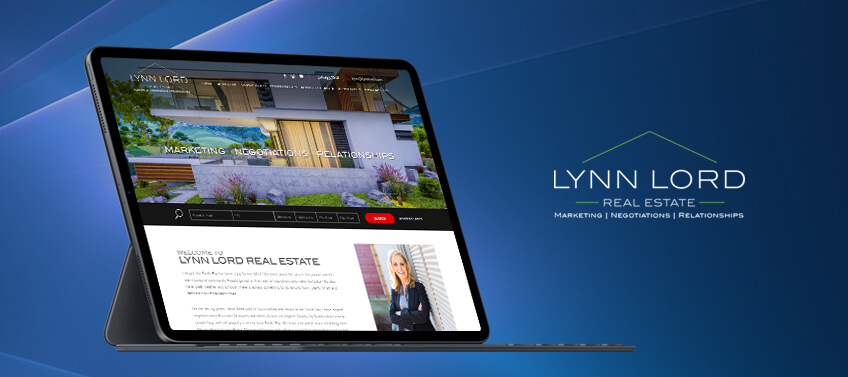
Lynn Lord Rolling Hills Estates, CA
Lynn Lord’s website may look low key, but it’s anything but basic. Its charcoal and ivory color palette with red accents, array of features, and modernized layout makes it a joy to scroll through on any device.
When the homepage opens, you’ll see the three most important things to Lynn Lord Real Estate: marketing, negotiations, and relationships. These keywords are displayed prominently on top of a neat slideshow. Each word is clickable and transports you to a page with relevant information.
Why this website is a standout: A classic color scheme, easily navigable design, and a whole host of real estate features—there’s a lot to love about LynnLord.com.

Let’s recap!
As you can see, this month’s top real estate websites have made the list for good reason! Here’s something that we absolutely loved about each one:
-
BobbyBoydLa.com – Bold branding and chic design.
-
GoldRealtors.com – Timeless design with elegant layout.
-
LisaYakulis.com – Refreshingly sophisticated style.
-
JesseAyalaEstates.com – Effortless elegance with a nice modern feel.
-
TheChadCarrollGroup.com – Superb realtor bio and team sections.
-
MayneChoiceRealty.com – Easy navigation and streamlined design.
-
TheGGreenAgency.com – Contemporary look complemented by subtle animation.
-
JasonWrightRealEstate.com – Video slideshow of the realty’s communities.
-
Improta.com – Great community overview and user experience.
-
LynnLord.com – Classic design with great web features.
As real estate professionals, your website is a core part of your brand image and online presence. The websites above are prime examples of what you can do when you think outside the box. It shows exactly how effective innovative designs and advanced features can make a website truly exceptional.
Give your website an upgrade this new year! Contact Agent Image for a free consultation or give us a call at 800.979.5799.
The post 10 Best Real Estate Websites for January 2020 appeared first on Best Real Estate Websites for Agents and Brokers.