First impressions matter in real estate. And with almost half of buyers beginning their home search online, a well-designed website will help you make a strong first impression on future clients.
Agent Image marries code and creativity to design websites that are attractive, intuitive, and effective. As you’ll see below, we’ve worked with the who’s who of luxury real estate—and we can’t wait to lend our expertise to you as well.
Here’s a look at the 10 best websites we launched in September 2020:
Joyce Rey Beverly Hills, CA
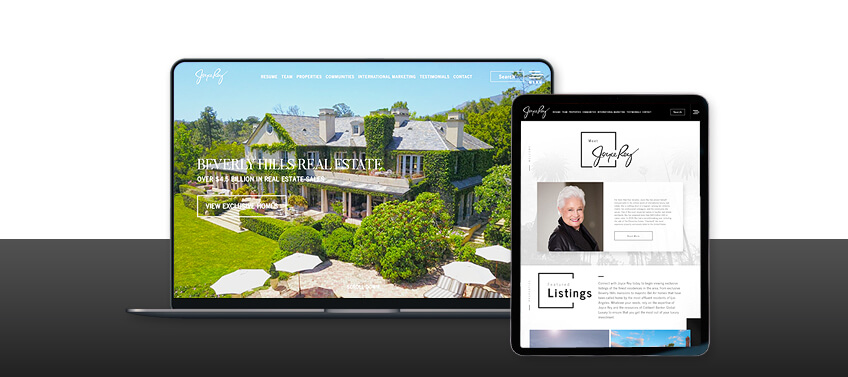
With over $4.5 billion in career sales, Joyce Rey is a bona fide legend in the luxury real estate market. And throughout her four-decade career, one thing hasn’t changed: her passion for matching people with the perfect property.
Visitors are greeted with a video tour of some of Southern California’s most prestigious homes—ones that only Joyce has access to. Below the fold, white space is cleverly used to create a sophisticated layout that puts the properties front and center. Featured listings and communities are also arranged in a grid for ease of browsing.
What makes this website stand out: The video tour brings Southern California living to life by giving site visitors a peek into the properties they could soon be calling home.
Toni Gilliard North & South Carolina
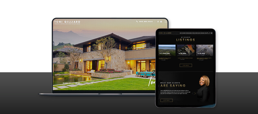
As a former immigration attorney, Toni specializes in helping international clients find a luxury home in the Carolinas. Her concierge service attracts many high-profile clients who demand dedicated attention and the utmost discretion.
The website we created proves that simplicity and functionality can indeed co-exist. Above the fold is a full-screen gallery of featured properties, but on the lower left side is a minimalist search bar. This simple yet stylish design is seen throughout the website and is complemented by a black-and-gold palette.
What makes this website stand out: From the look and functionality of Toni’s website, one immediately gets the feeling that they will receive nothing short of VIP treatment.
Nalishma Carvelho Sonoma County, CA
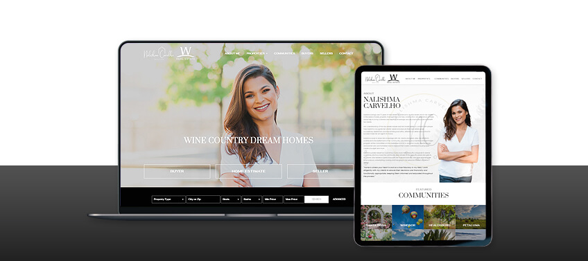
Unparalleled service is key for Nalishma, whether she’s helping clients find their dream home or volunteering for Sonoma County’s Committee on the Shelterless. This sense of service extends to her website, which provides all the features a visitor needs above the fold.
Without needing to scroll down further, users will find quick links to the buyer portal, seller portal, and the home valuation tool. The featured property section is a dynamic gallery that highlights the most-searched-for homes of the week, making it even easier to find the perfect property.
The straightforward layout and dark colors take a cue from Sonoma County’s leisurely living and the fertile soil in this famed wine country.
What makes this website stand out: Ease of use is placed front and center on this functional but elegant website.
Galuz Group Los Angeles, CA
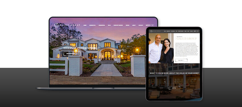
Yana and Alex Galuz have over 30 years of combined experience in luxury real estate, investment properties, and land development in Los Angeles. Fittingly, their website encapsulates the concierge-level service this power couple delivers.
The first thing visitors see is an edge-to-edge photo of a featured property, its facade an invitation to explore further. A button overlaid on this image takes visitors to the available listings. Video tours of listed homes give visitors a first-hand look at the deluxe properties Yana and Alex can connect them with.
The parallax design lends an air of fluidity and sophistication to the website. Property photos are all oversized to further highlight the features of each home.
What makes this website stand out: This site makes luxury home-buying more personal by taking people inside the properties themselves.
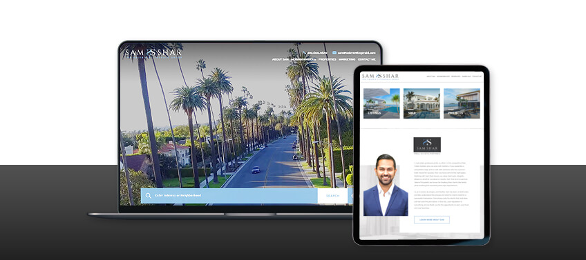
Sam Shar Los Angeles, CA
Understated luxury was our guiding principle when designing Sam Shar’s website. The tasteful blue-and-white palette communicates the sophisticated but breezy lifestyle Los Angeles offers.
The sleek design also means that important features are placed at the forefront, such as the property search bar. And to achieve an uncluttered look, properties are neatly categorized according to status (active or sold) or neighborhoods.
Testimonials and helpful blog entries further establish Sam’s reputation as one of L.A.’s leading luxury real estate agents.
What makes this website stand out: Style meets substance in this website, where both aesthetic appeal and usability take center stage.
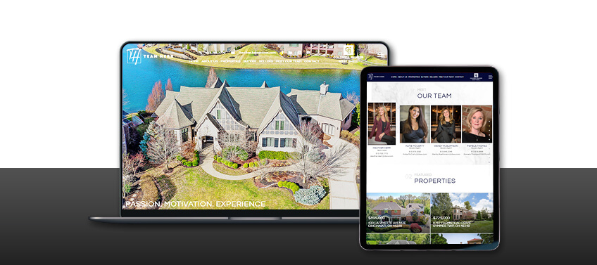
Heather Herr Cincinnati, OH
Heather understands that creating a picture in a client’s mind is crucial to convincing them to buy a luxury home. As such, the site opens with a full-screen gallery of home interiors, making it easy for people to imagine living there.
The featured properties are laid out in oversized grids, like postcards from a place you’d love to call home. Likewise, artfully shot videos give potential clients an intimate look into some of the most sought-after homes in Ohio.
A streamlined user interface was key to designing Heather’s website. Each section is clearly delineated and discrete dots on the right of the screen serve as convenient navigation buttons.
What makes this website stand out: This website brings listed properties to life with an engaging combination of pictures, videos, and a streamlined user interface.
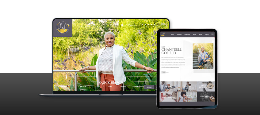
Chantrell Cofield Atlanta, GA
At first glance, ChantrellCofield.com might seem like an interior design website—until you see the property search feature and realize that these stunning homes are actually for sale.
Of course, effortless elegance is second nature to Chantrell, who holds a Certified Luxury Home Marketing Specialist Membership (CLHMS). Sophisticated touches can be found throughout the website, from the sleek grey-and-white color scheme to the grid-like arrangement of core site features.
Informative blog posts and testimonials highlight her unique brand of client service founded on expertise, integrity, loyalty, and professionalism.
What makes this website stand out: Searching for a home in Atlanta has never been easier, thanks to the website’s interactive property map.
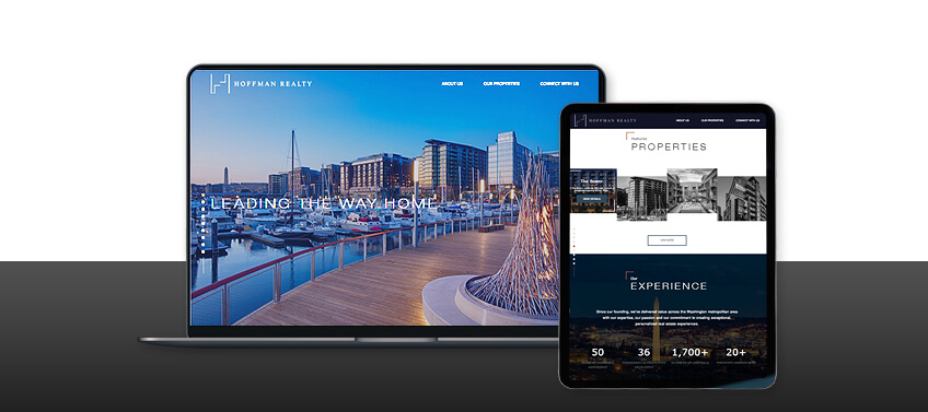
Hoffman Realty Washington, D.C.
Can a real estate website be minimalist yet eye-catching? HoffmanDev-Realty.com proves that the answer is a resounding “yes.” From the spare yet striking logo to the restrained color palette, every element is at once refined and compelling.
It has a distinctly modern feel, with design elements that pop into view upon scrolling, giving the artfully austere site a dynamic feel. The dark and muted tones lend an air of authority which befits one of the D.C. area’s most respected property developers.
What makes this website stand out: Carefully curated design elements make this minimalist website a true showstopper.
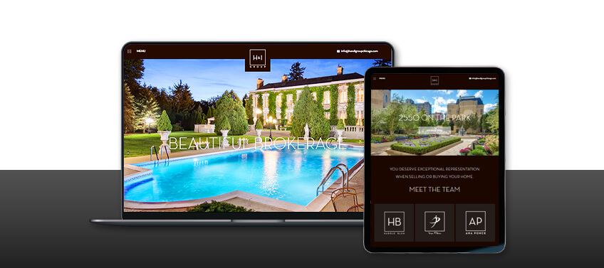
H&I Group Chicago Chicago, IL
The words “Beautiful Brokerage” welcomes visitors to H&I Group Chicago’s website. It’s a bold claim, but one that’s backed up by gorgeous photos of their luxury listings.
True to form, bold design elements are a hallmark of HandIGroupChicago.com, from the dramatic all-black palette to the full-sized, high-definition images. A slim, sans-serif font and a parallax theme further enhance the site’s chic look.
Of course, usability is just as important as style. Listings are grouped by community, and helpful resources like a home valuation tool, neighborhood guides, and market reports are all freely available.
What makes this website stand out: H&I Group Chicago’s website perfectly embodies the elite properties it represents.
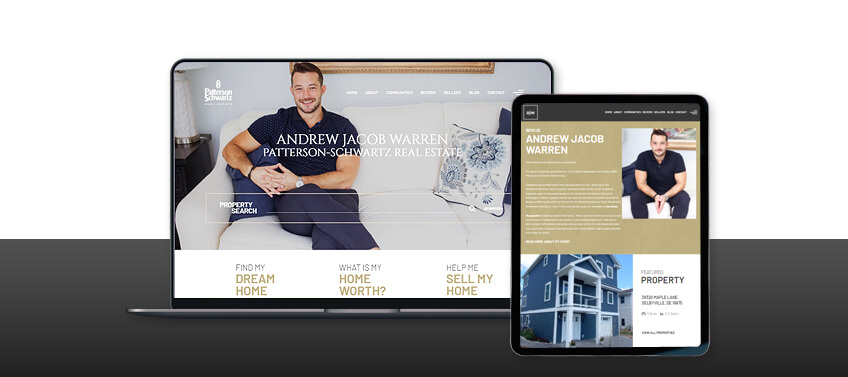
Andrew Jacob Warren Delaware
For Andrew, one word best describes Delaware: home. That’s why he’s passionate about helping clients find the perfect home in the Diamond State.
In line with this, his website makes it extremely easy to find the ideal property. A search bar appears above the fold, while buyers and sellers each have dedicated portals. Listings are also organized by neighborhood, allowing site visitors to explore what makes each one special.
Gold and white are prominently featured on the site, serving as a nod to the friendly and wholesome lifestyle buyers can look forward to in Delaware.
What makes this website stand out: The website puts itself in the visitors’ shoes and makes sure everything they need is just a scroll and click away.
September’s top 10 websites, in a nutshell
House hunting online is now the new normal. That’s why a website is no longer just nice-to-have—it’s your digital calling card and online storefront rolled into one.
Let’s recap how Agent Image helped these agents and brokerages achieve online success through expert website design:
-
JoyceRey.com: A sophisticated layout and property-centric design highlight the expertise that only a legendary luxury real estate agent can provide.
-
ToniGilliard.com: Simplicity and functionality beautifully intersect in this website for an agent who is known for her concierge-like service.
-
WineCountryDreamHomes.com: For a service-focused agent, we created a website where user-friendliness and ease of access were at the forefront.
-
GaluzGroup.com: By giving visitors an intimate peek into listed properties, this website creates an engaging experience that truly leaves an impression.
-
SamShar.la: Straightforward design, clean organization, and a breezy color palette combine to create a site that captures the sophisticated but relaxed L.A. lifestyle.
-
TeamHerr.com: To create a vivid picture of what it’s like to live in the listed properties, the site uses a combination of stunning photos and artful videos.
-
ChantrellCofield.com: Effortless elegance and an interactive property map make this website truly a cut above the rest.
-
HoffmanDev-Realty.com: We designed a modern and minimalist website that dazzles, thanks to clever but judicious use of animation.
-
HandIGroupChicago.com: For a firm that offers “Beautiful Brokerage,” we created a website with a bold yet chic look.
-
AndrewJacobWarren.com: Our design reflects the agent’s passion for real estate, and the site has easy-to-find resources for buyers and sellers alike.
Do you want to take your agent or brokerage website to the next level?
Rely on Agent Image’s 21-year expertise in web design and development to make it happen. Our team provides end-to-end services, from conceptualization, to design, to execution—we are your one-stop-shop for amazing real estate websites.
Call 800.979.5799 today for a FREE consultation. And be sure to scroll below to check out our various packages.
The post 10 Best Real Estate Websites for September 2020 appeared first on Best Real Estate Websites for Agents and Brokers.