
A real estate website represents the best idealized version of your business. It serves as a window for potential clients, a tool where they can scope all the services you offer.
At Agent Image, we create beautiful, user-friendly, and functional real estate websites that can take your business to another level.
Here are the top 10 best websites we launched in July 2020:
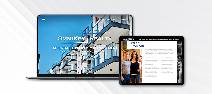
Omni Key Plano, TX
Omni Key Realty establishes their authority as a trusted property management company in Central Texas with bold imagery and sophisticated colors. To further cement their position as an industry leader, badges of their certifications and designations are prominently displayed.
All of the essential tools can be accessed from the site navigation on the top of the page. The quick search right below the welcome slideshow also allows visitors to get to business straight away.
What makes this website stand out: The images used for the homepage all feature Omni Key Realty, allowing potential clients to see the faces behind the successful company.
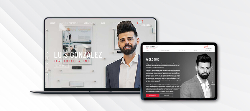
Luis Gonzalez Scottsdale, AZ
GonzalezLuxuryGroup.com perfectly captures Luiz Gonzalez’s energy. The color scheme of grey and white is sleek, modern, and professional, while the red accents give a youthful edge to the overall look.
This real estate website is also a great example of the “less is more” philosophy. Clean lines are used throughout, shifting the focus from the design to Luis Gonzalez’s message and services. His affiliation with The Agency RE is also proudly displayed with a badge on the top-right corner of the homepage.
What makes this website stand out: Visitors can use the interactive map to zoom in on all of the latest property listings in and around Phoenix.
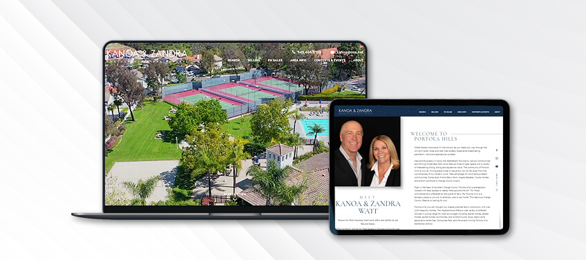
Kanoa Watt Portola Hills, CA
Instead of shining the spotlight on himself, Kanoa Watt wants all eyes on Portola Hills and its real estate. Potential clients are offered glimpses of the community through fly-by videos of Portola Hills’ neighborhoods and surrounding areas.
Portola Hills also shines through in the web copy. After visitors are welcomed warmly, they are treated to information about Portola Hills. The copy paints a bigger picture of the community and why it is a great place to live.
What makes this website stand out: The emphasis on location and community speaks positively of Kanoa Watts and his role as an expert on Portola Hills real estate.
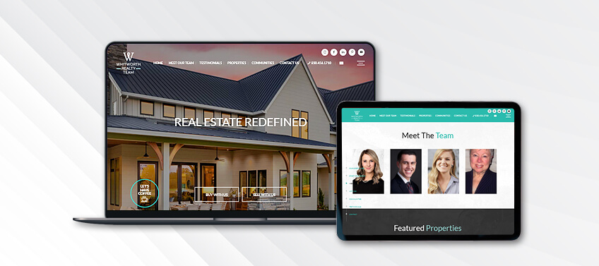
Whitworth Realty Team Fredericksburg, TX
A core part of Whitworth Realty Team’s business is to provide the best real estate service possible. And this experience starts with their website. Clear, concise, and direct to the point, potential clients can get started right away as soon as the homepage loads.
Visitors can also meet Whitworth Realty Team’s pool of real estate experts further down the page. From the get go, prospective clients will know who they will be working with. Cerulean accents in the color scheme lighten up the site’s professional tone.
What makes this website stand out: The small “Let’s have coffee” button in the homepage breaks barriers, allowing Whitworth Realty Team to instantly connect with potential clients.
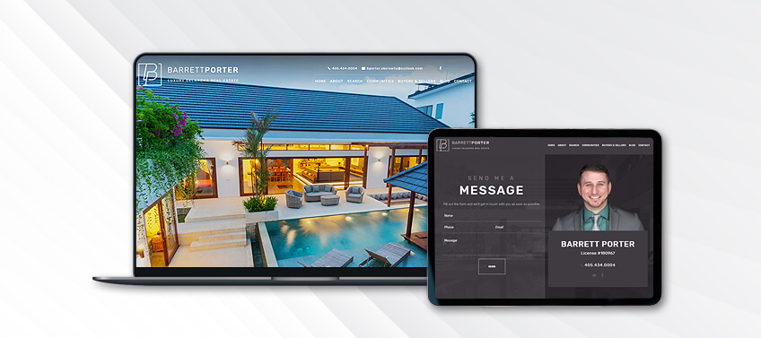
Barrett Porter Oklahoma City, OK
BarrettPorter-RealEstate.com lets the fine luxury homes of Oklahoma City real estate do the talking. Set against a homepage bathed in muted brown and pearl white, high-definition photographs of luxury properties are presented in a slideshow. It’s the very first thing potential clients will see, and enough to pique their interest.
More properties for sale can be seen further along the homepage, along with dedicated buttons for featured communities and real estate services.
What makes this website stand out: Barrett Porter’s website has a finance guide and mortgage calculator to help home buyers and sellers plan for their transactions ahead of time.
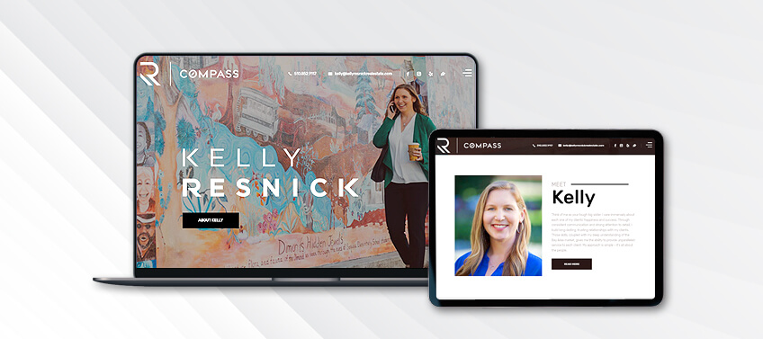
Kelly Resnick San Francisco, CA
In a highly competitive real estate market like San Francisco’s, one needs a solid presence to guide them in every real estate transaction. Kelly Resnick is that person, and this is a message she conveys well through her real estate website.
“Think of me as your big sister,” Kelly Resnick says in her introduction. Tough, but caring and ultimately wants what’s best for her clients. Each design feature backs up this branding. The rich coco accent color is solid yet warm. The tone of the copy is direct and concise. And the choice of imagery is highly evocative of San Francisco.
What makes this website stand out: Potential clients can learn more about Kelly Resnick’s experience by quickly scrolling through her most recent transactions further down her homepage.
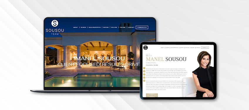
Manel Sousou Danville, CA
California sophistication is what Sousou Team’s real estate website is all about. It is there, from the picture slideshow of Danville real estate to the elegant color scheme of white, dark grey, and pale gold. The leader herself, Manel Sousou, is the epitome of a sophisticated real estate expert.
Following the introductions, the homepage flows to showcase the latest property listings in the market and the best places to live in the area.
What makes this website stand out: SousouTeam.com is not only about style. The website also highlights Manel Sousou’s unique selling proposition. It proves why her real estate team is the best people to work with in and around Danville.
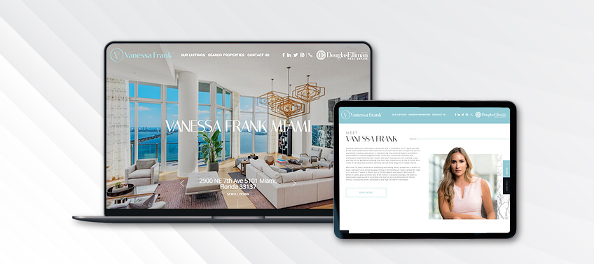
Vanessa Frank Miami, FL
Key aspects of Miami lifestyle are thoughtfully embedded in the design of VanessaFrankMiami.com. The fresh color palette of white and haint blue are reminiscent of the beach. It also gives a fresh breath of air to the otherwise perfectly professional and succinct look of the website.
At the top of the page, two distinct brands can be found: Vanessa Frank in a stylish typeset and the Douglas Elliman badge. The entire website reads like a high-end magazine, specifically produced for those interested in Miami luxury real estate.
What makes this website stand out: The Instagram plug-in features real-time posts and makes Vanessa Frank all the more relatable and approachable.
Catryn Fowler San Diego, CA
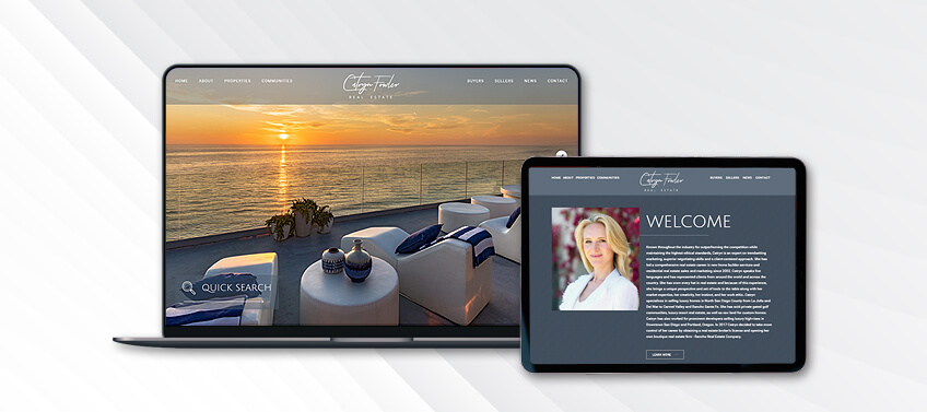
Although Catryn Fowler is a trendsetter in marketing San Diego luxury real estate, her real estate website has a more toned down and refined look. The overall aesthetic is pared down, with dark blue-gray accents that allow each high-definition image to shine.
The subtle use of patterns in the same color family adds more visual interest. All of these key design elements prove one doesn’t have to shout in order to be heard.
What makes this website stand out: CatrynFowler.com uses one of the newest Agent Image X templates: Royale.
Kevin Kim Newport Beach, CA
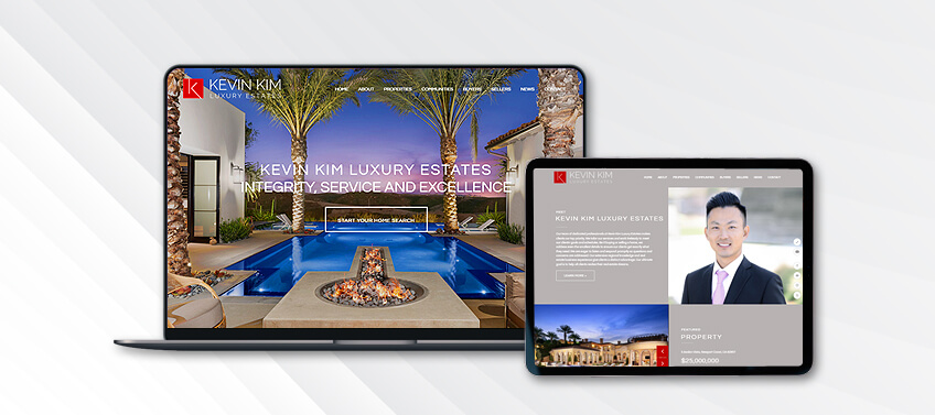
KevinKimEstates.com puts an Orange County spin on the new Agent Image X Seneca design template. The modern sans serif font is current and the color palette is sure to appeal to a wide range of potential clients.
Thanks to the seamless layout, the website is extremely easy to use and navigate. The site navigation is clear and prominent. The red hover animation is striking to look at and adds a sense of purpose to every click.
What makes this website stand out: Instead of the standard solid-color borders for the site buttons, they are set against pictures. It’s a different take on the usual borders designers so often use.
In conclusion
There is no single cookie cutter that makes a real estate website amazing. There are, however, essential elements that can take it to the top: effective personal branding, intentional and thoughtful design, and overall functionality.
Let’s take a look at our top 10 real estate websites for July 2020 again:
-
OmniKeyTexas.com – Professional photography that features the team
-
GonzalezLuxuryGroup.com – The interactive map that makes property searches a breeze
-
PortolaHills.net – Emphasis on the location and the lifestyle
-
WhitworthTeam.com – Professional yet amiable tone plus the bright palette
-
BarrettPorter-RealEstate.com – Dedicated tools to help potential clients plan ahead
-
KellyResnickRealEstate.com – Practical features such as property listings and the option to view recent transactions
-
SousouTeam.com – Consistent and cohesive branding tied to their unique selling proposition
-
VanessaFrankMiami.com – The social media plug-in that makes her relatable
-
CatrynFowler.com – Interesting use of patterns as well as the new Agent Image X Royale template
-
KevinKimEstates.com – The playful use of pictures as borders to break the color scheme and tone
Were you inspired by our top picks from July 2020? You are welcome to try out new things to revamp your website. Who knows, we might feature your real estate website in one of our upcoming lists.
Start a conversation with our team today at 800.979.5799 to see how our designers can freshen up your real estate website.
The post 10 Best Real Estate Websites for July 2020 appeared first on Best Real Estate Websites for Agents and Brokers.