
The Fall season is largely associated with the colors that it brings. The start of Fall brings on a vibrant mixture of earth-toned landscapes accentuated with colorful foliage, burnt-orange pumpkins, and ruby-red apples. Fall colors have a way of evoking warm, cozy feelings. The season also signals a nice change of pace as the year comes to a close.
While rich, warm tones are a staple of the season, they are also very versatile, making them easy to incorporate into any website design. Using Fall colors for your website is a great way to make sure your brand is on top of the current season, and shows your audience that you’re paying attention and are up-to-date on the latest trends.
In this article, we’ll take a look at a few Fall-inspired color combinations and how they can work for your website:
Complementary Combinations
-
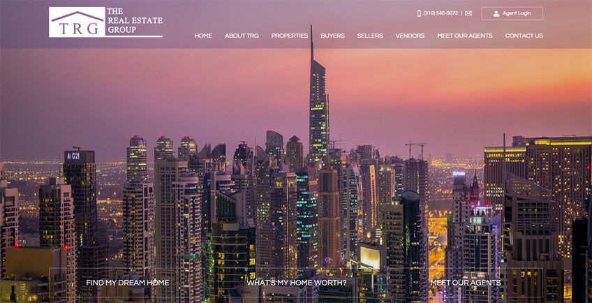
Fall-inspired designs typically use shades of orange, red, and pink as the primary color scheme. The use of purple can add a unique twist to the traditional, creating a fresh and inventive look.
-
Purple is a regal color, and works very well when paired with yellow and gold tones.
-
Purple and yellow are complementary tones placed right across each other on the color wheel. Incorporating complementary colors on your website is a great way to create powerful contrast.
Focus on the Feeling
-
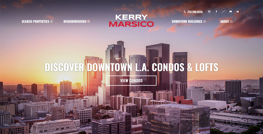
You can utilize color to spark a particular emotion for the viewer. Blue, for example, often makes us think of the sky or the sea, making us feel more relaxed in an instant. The same association works for other natural colors of the season, reminding us of warm and fond memories.
-
Using colors that are heavily associated with the season can help viewers recall Fall-related themes such as the cozy comforts of home, friends and family, and Thanksgiving.
-
Fall tones can add a very homey and welcoming vibe to any website.
Warm Visuals
-
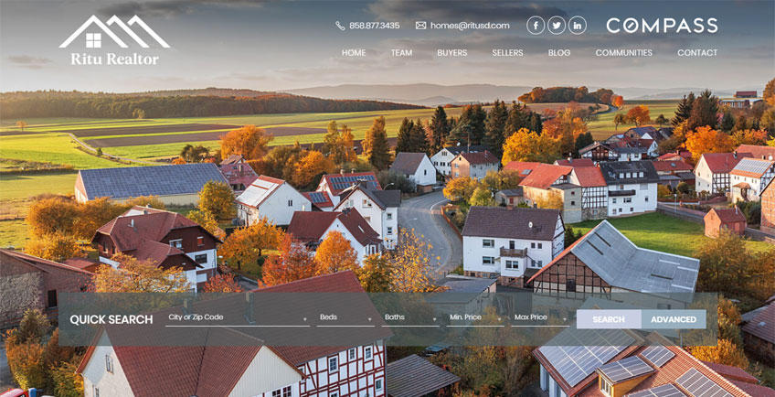
Orange, red, yellow, and brown are tones associated with warmth, fire, earth, and sunlight.
-
Using images that highlight textures, shadows and depth also helps to set the mood. Selecting photos that use warm filters or sepia tones can add to a warm and comforting vibe to make visitors feel right at home.
-
Fall colors are naturally mellow and toned down, and when used the right way, they can create a very laid back atmosphere.
Branching Out
-
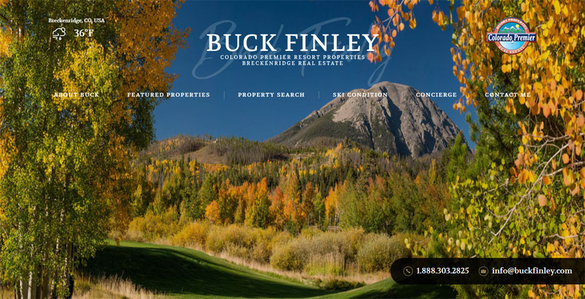
You can opt for a monochromatic palette for your website, using a single hue, but repeated in varying in levels of brightness and saturation.
-
This particular approach to color creates a very polished and sophisticated look, as it tends to blend seamlessly when evenly distributed throughout the website.
-
Colors that have the same base tone match well with one another and have plenty of flexible uses when it comes to website applications that need subtle differences in color, such as button design, contact forms and coordinated text headings.
Quiet Elegance
-
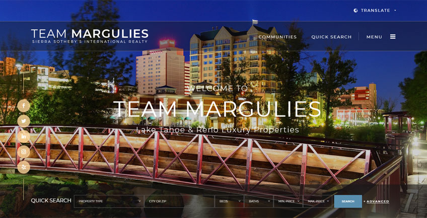
Muted colors have lower saturation and don’t appear as intense as pure bright tones. This is a great choice if you want to create a more cool-toned Fall-inspired look.
-
These understated colors can also evoke a vintage feel due to their light and faded appearance.
-
The use of cream, beige or off-white combined with lilacs, lavenders, and soft yellows can also create a playful and dreamy palette.
Why use seasonal branding?
When it comes to brand identity, seasonal branding is considered an extension of general branding. General branding covers the very essence of your business, giving meaning to your product or service by representing your goals, values, and identity as a company. All elements used in your general branding are designed to create an emotional response for clients or customers interacting with your company.
The use of seasonal branding isn’t meant to overhaul your entire branding. Rather, it simply serves as a modification or enhancement to your brand identity, and is designed to add a seasonal twist while maintaining your branding at its core. Once the season winds down, you have the option to revert to your general branding or adopt a new look to match the next season.
Seasonal branding can create a more dynamic appearance for your site
While maintaining a consistent branding image is important, sticking with the same look for marketing materials such as your website, email newsletters or flyers can also give the impression that your company seems stagnant. While changing things up too frequently won’t make sense financially or for your long-term and lasting image, it’s also worthwhile to think of how your brand can tackle innovation and have the flexibility to flow with the changing seasons.
Seasonal updates are a terrific way to enhance your company’s branding without the need for a total overhaul. Any minor changes you apply to your branding makes your business look active and on the pulse with the times. It gives the impression that you’re not just going through the motions and banking on your previous successes to move you forward.
With seasonal branding, you are showing your audience that you are proactively maintaining your image and looking for creative ways to grow your brand. You can effectively draw the attention of existing and potential clients, since they will most likely be curious to know what your company will come up with next!
Want to add Fall colors to spruce up your site? Talk to us at Agent Image about seasonal branding! Contact our expert designers and marketing strategists today at 800.979.5799 for your free consultation.
The post Spruce Up Your Website With a Fall-Inspired Look appeared first on Best Real Estate Websites for Agents and Brokers.