August represents the culmination of the real estate industry’s busy summer months. But just because we’re heading into the doldrums doesn’t mean you can’t generate leads anymore.
As long as you have a hardworking website to bolster your online presence, you’ll always have an advantage. This month’s selection of the best real estate websites is proof of that.
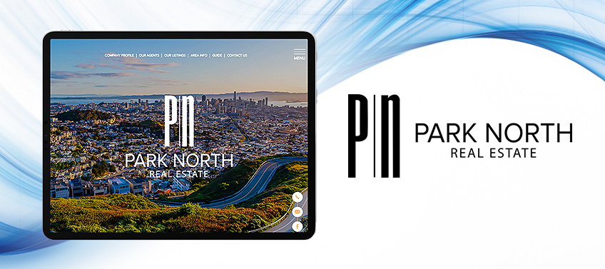
Park North Real Estate San Francisco, CA
Park North Real Estate’s website, just like San Francisco, is a study in contrasts. On one hand, you have a sleek layout complemented by crisp pictures and fluid animations. At the same time, black-and-white photography is used in the featured properties and communities to evoke a classic charm. Orange accents also add vibrance to the site and capture the sunny climate the Bay Area enjoys.
What’s unique about this website? While black-and-white photos are used throughout the site, there’s a nifty design trick that will undoubtedly delight visitors: just hover your mouse on the images and they’ll be displayed in full color.
Julie Fitts Queen Blue Ridge, GA
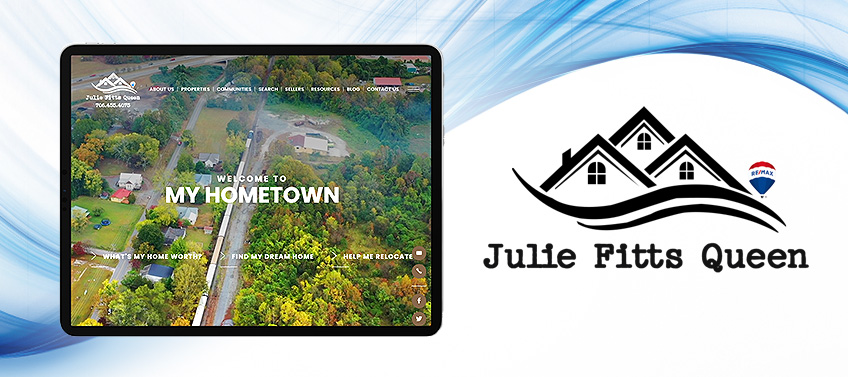
When you specialize in a property market as inherently picturesque as Blue Ridge, GA, all you need to do is let the place speak for itself. This is why Julie Fitts’ website opens with a video that captures daily life in the city interspersed with shots of scenic outdoor attractions. This down-home approach is reflected in the black-and-white color palette, simple layout, and typewriter-inspired font. The photos also have a subtle filter that creates a vintage-like appeal.
What’s unique about this website? Our team created an interactive map for this website as part of our IDX integration. To elevate it, though, we used colorful icons to represent landmarks and attractions, similar to old-school theme park maps.
Ben Kruger Beverly Hills, CA
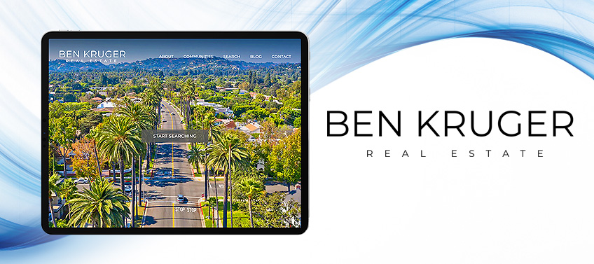
True luxury is effortless and subdued — traits we kept in mind while designing Ben Kruger’s website. Black and white was a fitting color palette as it immediately connotes elegance while also serving as the perfect backdrop for the stunning photos of multi-million dollar abodes. The generous white space, meanwhile, creates an uncluttered layout that lets the eye roam. And to make finding the perfect home easy, the property search button is integrated right into the banner image.
What’s unique about this website? Ben specializes in many of Los Angeles County’s most prestigious neighborhoods. That’s why we built an interactive map that lets visitors explore each one. Even better, hovering on a locale reveals a short blurb that gives a sneak peek into the area.
Tasha Maag Group Cincinnati, OH
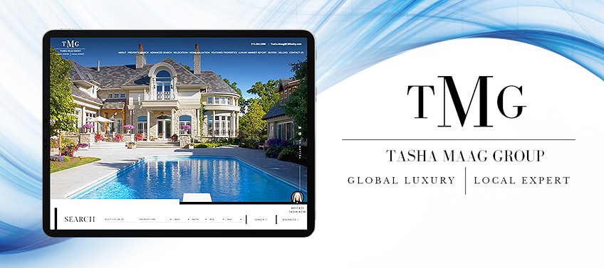
TashaMaagGroup.com has the functionalities of a modern website and the sensibilities of a glossy magazine. This is immediately apparent in the opening video, which features fine homes and impeccable interiors that won’t feel out of place in architectural magazines. Scroll a little lower, though, and you’ll find a full-fledged property search tool with extensive filters. Likewise, featured communities are arranged in an Instagram-like grid to maximize the number of items displayed per scroll. This seamless marriage of form and function truly sets Tasha Maag’s website apart.
What’s unique about this website? How do you make a sophisticated website even more elegant? For this project, we made use of gradients and background images to add further depth and style.
RE/MAX Property Group Edinburg, TX
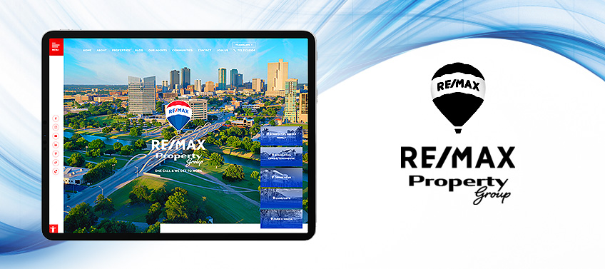
The website we designed for RE/MAX Property Group proves that you can be functional without sacrificing flair. While the site has the real estate company’s signature brand colors and logos, our team was able to give it an interesting twist. This is most apparent in the fact that each scroll of the website corresponds to a single section, almost as if you’re going through a flip chart. Apart from being unique, this approach also creates a more focused browsing experience. We also applied textures and muted photos on the background for enhanced visual appeal.
What’s unique about this website? From the home screen, site browsers can easily track down their ideal property thanks to shortcuts dedicated to different listing categories.
Seaport Real Estate Savannah, GA
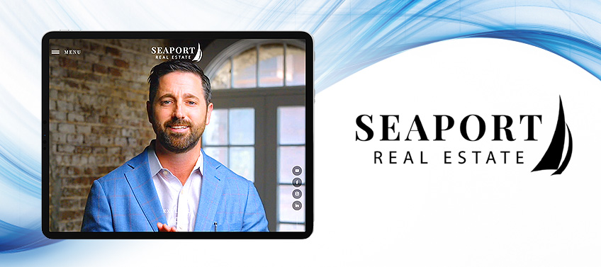
Seaport Real Estate understands the power of video in real estate marketing, so it’s only natural that its website opens with a manifesto from broker and owner Ben Bluemle. As for design, we thought it fitting to create a contemporary look to match this brokerage’s digital savviness. Geometric shapes and lines are thus a key component of the site’s design, along with generous white space. Shortcuts to the team’s social media pages are also placed on a floating column to the right so it is accessible no matter where you scroll.
What’s unique about this website? This brokerage prides itself on offering reliable and personable services to clients. As such, it has a dedicated video section where site visitors can get to know the agents they could soon be working with.
The Vega Group Sunny Isles, FL
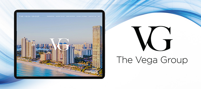
The Vega Group has expertise and prestige embedded into its DNA. It is, after all, led by the father-son team of Ozzie and Dylan Vega, who have over 40 years of combined real estate experience between them. Fittingly, we made sure to incorporate the group’s stylized initials in the banner section, featured properties, and background images to highlight its legacy of excellence. Golden touches also grace the website, symbolizing the deluxe homes The Vega Group represents. The crystalline waters of Florida are subtly integrated into the background as well — a reminder of the leisurely lifestyle that awaits buyers in the Sunshine State.
What’s unique about this website? Attentive service is the cornerstone of The Vega Group’s success. This is reflected in the portals created specifically for buyers, sellers, and investors.
Origen Realty Baytown, TX
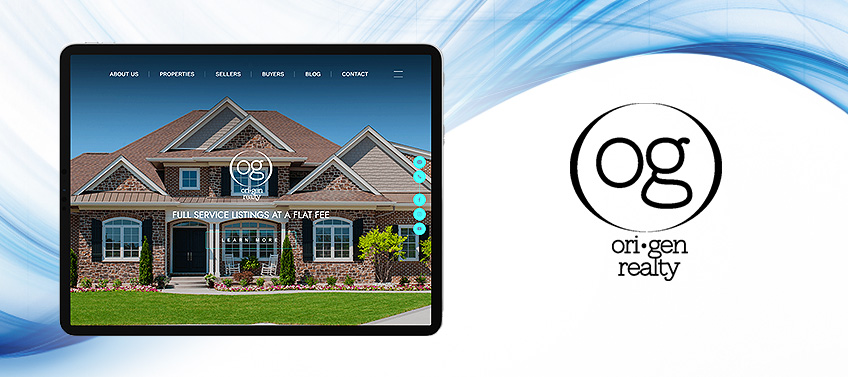
Origen Realty offers a refreshingly simple promise: it will sell your house for a flat fee regardless of its asking price. This straightforward yet forward-thinking approach to real estate is something we wanted to capture in the team’s website. The simple layout flows seamlessly from top to bottom, ensuring that everything a visitor needs can be easily found in a few scrolls. Black and green also figure prominently in the design, with the former connoting credibility and the latter evoking innovativeness.
What’s unique about this website? Like many real estate websites, OrigenRealty.com touts its sales accomplishments. Unlike others, however, it also shows how much clients can save per transaction thanks to its flat fee.
Nick Vlasidis Arlington, OH
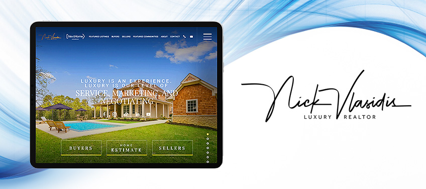
Nick Vlasidis believes that luxury is an experience. So aside from selling luxury homes, he also provides white-glove service that his discerning clients deserve. There’s little surprise, then, that his website is filled with opulent design touches and user-friendly features. Take, for example, the gold touches and marble-like textures used on the site. Or the black-and-white palette that connotes sophistication. At the same time, features such as buyer and seller portals ensure that visitors’ needs are met with no delay — as is only proper when working with a luxury realtor.
What’s unique about this website? Attention to detail is what sets apart an elite agent from a merely great one. That’s why we also made sure to add little details that made Nick’s website extra special. For instance, notice how the call-to-action buttons turn gold once you hover over them.
Lush Investment Pompano Beach, FL
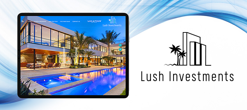
To visit Lush Investment’s website is to be transported to the sandy shores and opulent homes of Pompano Beach — an effect achieved through a full-screen gallery featuring seaside vistas, luxury developments, and sumptuous interiors. True to the spirit of the city, this site sports a casual yet upscale design. For example, the featured properties are rendered in a collage-like arrangement that’s truly eye-catching. The blue-and-white palette, along with silhouettes of palm trees in the background, paint a vivid picture of the leisurely lifestyle that clients can enjoy.
What’s unique about this website? Laura Lucinda’s initials have been stylized to serve as a logo. It’s then superimposed on featured listings when a mouse hovers over them.
Recap of standout features
A great website is a great asset to have in today’s ultra-competitive real estate market. And with their excellent features, this month’s spotlighted websites truly give their agents a competitive edge.
- Park North Real Estate – Hover over the featured communities and properties to see black-and-white photos bloom in full color.
- Julie Fitts Queen – The interactive map boasts an old-school charm thanks to colorful icons that represent landmarks.
- Ben Kruger – There’s so much to learn about L.A.County’s various elite neighborhoods. Luckily, the interactive map has blurbs that offer visitors a sneak peek.
- Tasha Maag Group – Gradients and background images liven up white spaces and give the website further depth.
- RE/MAX Property Group – Portals for different property types make it very easy to find the one worth investing in.
- Seaport Real Estate – Videos featuring the brokerage’s agents highlight its personable service.
- The Vega Group – The group’s hands-on service is exemplified by shortcuts designed for buyers, sellers, and investors.
- Origen Realty – To highlight the flat fee the team charges, its sales achievement section also includes estimated savings for clients.
- Nick Vlasidis – Luxury is the hallmark of Nick Vlasidis’ service. As such, the call-to-action buttons on his site turn gold when users hover over them.
- Lush Investment – Laura Lucinda’s initials are superimposed on featured listings when moused over – a subtle but elegant touch.
A beautiful and effective website is an investment that always pays dividends. Allow Agent Image to revamp yours so you can unlock more milestones. From design, to coding, to search optimization, our team can do it all.
And the best part? We offer FREE design consultations! Just call 1.800.979.5799 to get started.