Have you noticed how indispensable mobile devices have grown to be for our day-to-day online activities?
Even if you still prefer browsing the web on a computer, your smartphone or tablet is more than capable of displaying online content with ease and convenience. What’s more, these handy innovations are also the most accessible devices available to you any given moment.
Website design is adapting to meet such evolutions in internet usage. For real estate professionals looking to stand out and make a mark in their markets, embracing mobile-friendly website design is a must.
Why mobile is the way to go
Did you know that more than 262 million people in the United States were already using their mobile devices to access the internet as of 2018? That number is projected to grow to more than 287 million within the next three years.
That’s a sprawling ocean to cast your net into to maximize your reach as a real estate professional. Missing out on millions of potential leads is simply out of the question for today’s top-producing real estate agent.
If internet marketing is all about putting your best foot forward to establish your presence online, you should be able to do so regardless of the device your target audience is using.
The key thing to note is that a mobile device operates differently than a computer. Not only are these devices smaller, the primary interface they use—touchscreen technology—is also significantly different.
Simply put, your website should look as good and work as well on a mobile device as it does on a computer. You should be able to offer the best and most enjoyable user experience on your website whether the viewer is sitting in front of their desktop PC or laptop, or fiddling with their smartphone while out doing an errand.
10 essential features that mobile-responsive websites must have
Now it’s time to dig deeper into the “hows” of making your real estate agent website truly mobile-ready. Look for these 10 crucial elements when you have your website designed for any device:
-
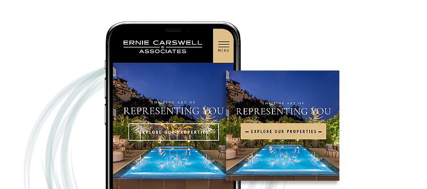
A great first impression
With the ever-growing volume of competition out there, you’ll want to make sure that your website easily stands out and effectively captures the attention of your target audience. Stunning visual design makes this easy.
We’re talking about more than just pretty pictures and fancy effects, however. Excellent visual design incorporates several crucial pieces into a single coherent system. The images you choose to use, the color scheme, the style of the buttons and icons, typography, and even the placement of focal points and white space must all be part of a consistent “message” that your brand wants to communicate.
Simply put, make your website flow. Design it so that it tells a story—whether your story or your brand’s—simply by the way it looks.
-
Intuitive navigation and control
Making your website mobile-friendly is all about maximizing simplicity and convenience for your viewers. You’re literally putting your services and expertise right at their fingertips, after all.
To this end, complement your striking visual aesthetic with a smooth, straightforward, and enjoyable user experience. For a handheld mobile device, the simple scrolling design works best. If your viewer can easily browse your webpages from top to bottom with a simple swipe of a thumb, you’re already on the right track.
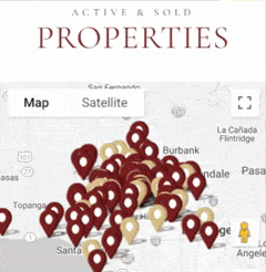
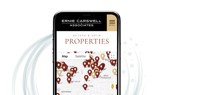
For interactive features like area maps or team photos with individual contact information, intuitive controls like pinch to zoom and other custom gestures will come in handy.
Remember to include a menu icon at the top to give your viewers a clear and convenient way to find specific sections of your website.
-
Clearly defined sections

An effective real estate website is one that is packed with rich features, resources, and content. But it’s important to present all these in an organized manner.
Make sure that your viewer knows exactly where they are and what they’re looking at as they scroll through your main page. From your full-page header image to your featured properties, customer testimonials, contact information, and more, everything should be recognizable and easily distinguished from each other.
For this, clever design elements include prominent headers or titles, distinct background changes, prominent boxes, or other graphic elements.
-
Dazzling multimedia content
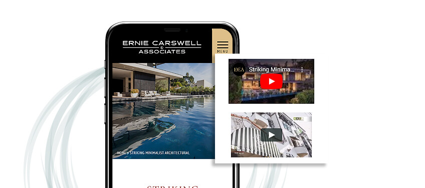
The internet is a visually driven medium, so you shouldn’t limit yourself to written content alone. As your main platform, your website is your best opportunity to get really creative with communicating to your target audience.
Make a strong impression on your current and potential clients by wowing them with high-quality photos and videos on your website. But always take note of how these will appear on different devices.
For example, landscape images look great on a large, horizontally-oriented computer screen, while portrait-oriented and square images maximize screen space better on mobile phones.
In addition to breathtaking images of your featured properties and communities, remember to include photos of yourself and/or your team, as well. This allows your viewers to put a face to the name, so to speak, boosting your brand’s recognizability and recall.
-
Readable text
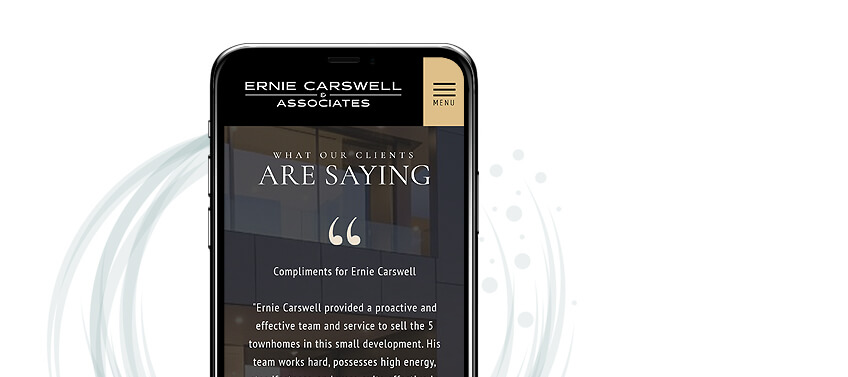
Images aside, your website still needs quality written content.
Your company and individual agent profiles inform interested, potential clients about your background, specializations, and accolades. Descriptions of your featured communities and listings help readers form better, more confident decisions. Essential contact details allow site visitors to easily connect with you. Regular blog posts and client testimonials establish your reputation and authority as a local industry expert.
The key to making all this content useful is readability, especially on smaller mobile devices.
Will your viewer be able to comfortably read the text content of your website at first glance? Will they have to pinch or gesture on the screen to enlarge the text? Good mobile-responsive design for your website addresses these concerns.
-
Adequately sized buttons
Once you’ve caught the attention of your target viewer, your next goal is to keep them engaged. Here is where how your website’s functionality complements your key elements comes in.
Smartphones and tablets not only have significantly smaller screens, they also lack the precision of a mouse pointer. Your website’s buttons, icons, and links have to be appropriately sized for viewers who will rely on their fingertips to navigate and activate your website’s features.
Proper spacing is likewise important, especially if a large amount of information is available (such as on listings pages and navigation menus).
-
A prominent and straightforward quick search bar
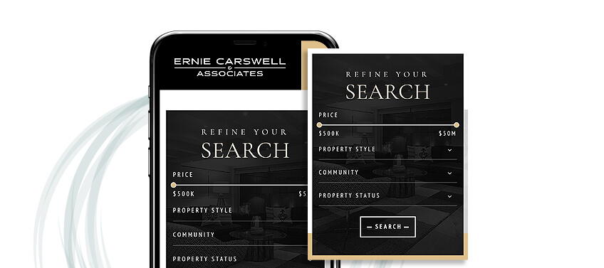
Many of the visitors you’ll get on your website are people eager to start their homebuying journey with a quick review of available listings. Give them a good head start with instant access to your website’s search functions.
Add a simple quick search bar on your home page that will let users instantly type in what they’re looking for. The smoother the experience your search functions offer, the more your visitors will want to return to your website for a more in-depth look.
-
A distinct tap-to-call button
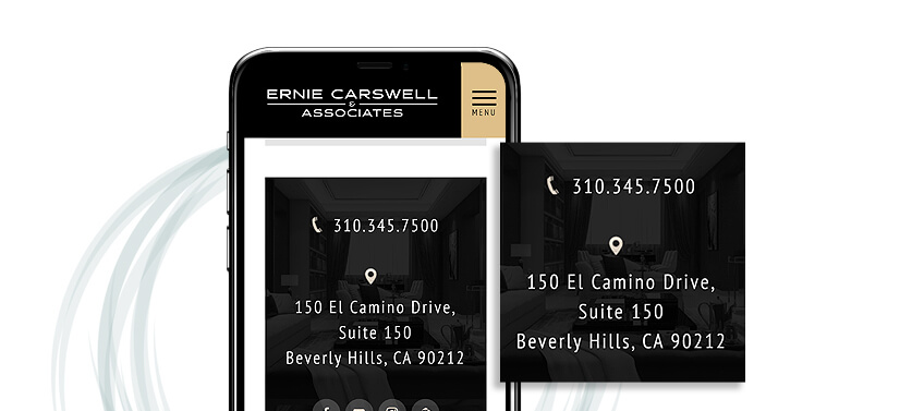
When your visitor is already holding a phone in their hands while viewing your website, you have a golden opportunity to start a conversation right away.
Display your contact number prominently, and make it clickable. Add an easy-access button that they can tap to automatically dial you up. It’s an elegant feature to include that will seamlessly integrate your lead generation.
-
Your complete business address
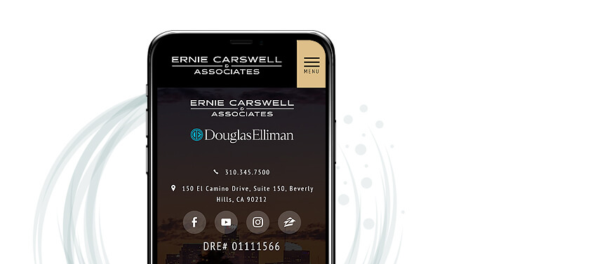
Use the footer of your website to display the full range of contact details that you want your viewers to have access to. This should include your complete business address.
While it’s unlikely that someone will mail in their inquiries, being transparent with your company address lends an important measure of credibility to your website. As a result, viewers will be more confident and at ease to do business with you.
-
Links to your social media channels
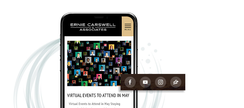
Aside from your website, what else do you think your current and future clients can access on their mobile devices? Chances are they also spend a significant chunk of time on social media, which is certainly another platform you can maximize for your online brand-building efforts.
Effectively integrate social media into your website and display your latest Facebook and Instagram photos in a stylish and eye-catching way. Also embed your original YouTube videos to enrich your website’s content. You encourage more comfortable engagement when you convince your website visitors to follow you on social media.
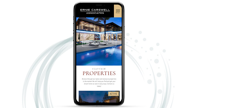
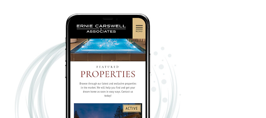
Do you want to see how all these elements can be incorporated into beautiful, mobile-responsive website design? Go ahead and take a look at CarswellAndAssociates.com on your mobile device to see and experience everything we’ve discussed here.
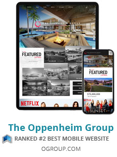
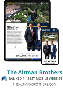
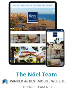
You can also check out these websites that won the Best Mobile Websites in 2019 Real Trends Website Rankings:

Want to optimize your website for mobile? Let Agent Image take care of it for you
On top of dedicated website features, it also helps to have a strong, complete marketing campaign that fully integrates your mobile user market. With sound strategies and the appropriate indicators and analytics to measure your progress, you can create an online presence that is both powerful and influential, no matter what device your target audience is using.
If you’re new to the nuances of digital marketing and creating effective website design, don’t worry. Agent Image has your back. Reach out to our expert website design and internet marketing strategists to get started on an exciting new path toward business relevance and success. Contact us here for a free consultation.
The post Essential Elements for Mobile-friendly Website Design appeared first on Best Real Estate Websites for Agents and Brokers.